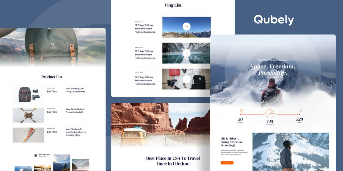
Traveling – it leaves you speechless, then turns you into a storyteller, said the great Ibn Battuta. Travel and adventure are what bring us close to nature and keep us connected with the world that we reside in. To connect the world with your travels though is another matter. That is where we come in, bringing you the new Wanderlust layout pack for Qubely Pro.
From showcasing your most amazing adventures to promoting your line of travel essential products and more, we have you covered. We have the perfect tool for aspiring travellers looking to set up their own website to earn from their travel. Also, veteran travel vloggers/bloggers to share their valuable experiences and tips of travel with the world. Look no further if you are setting up a travel website to look as aesthetic as your amazing travels.
Highlighted Features of Wanderlust
Wanderlust is designed so travellers can mesmerize their viewers with their mesmerizing adventures. A must-have requirement for this kind of page is a simple lightweight design with lots of breathtaking images, and we have delivered that and more. Responsive and easy to navigate, a store that can promote your merchandise and interact with viewers, Wanderlust has got you covered.
Take a glance at some of its highlighted features:
- Lightweight and fresh design
- Ease of navigation
- Simple and responsive
- Eye-catching hero section
- Dedicated product pages
- Detailed destination highlight page
- Straightforward contact form
- Video showcase with description
With all the hype set, let us, in today’s article take a closer look at what Wanderlust has to offer its viewers.
The Wonderful Pages Inside Wanderlust
Wanderlust has been carefully prepared with travellers in mind and it shows. Brilliant, pleasing to the eye layout for every page that elevates the content within captivating viewers that they cannot look away. The layout pack was curated so that the content of your site will reflect exactly the story you want to tell your viewers.
Here are the individual pages Wanderlust comes loaded with.
- Home
- Destination
- Destination Details
- Vlog
- Vlog Details
- Product
- Product Details
- Masonry
- Classic
- About Me
- Business Contact
Join us as we take a thorough look into each of the pages:
Home

The homepage to your site has to be the hook for your audience, and with Wanderlust you will have exactly that. A stunning hero section introduces you to the viewers and showcases your travel achievements in short. The blog section strikes curiosity in the viewers and persuades them to dive deeper into your travel tips and adventures. Highlights of your travels can be split up into parts that show snippets of food, culture and of course beautiful experiences. At the bottom, we have a seamless transition to have your social media page displayed to your viewers.
Destinations

Flaunt your hand-picked travel top spots to your viewers with well-designed cards. At the foot of the page, you can also appeal to your viewers to join your newsletter for more updates from you.
Destination Details

The main highlight of the show, a brilliantly designed page that does all. Add all the details you need to provide for the customer to be completely sucked in and be encouraged to start travelling. You can put a description of the destination you are suggesting with a map snippet right beside each other. Show the estimated budget needed and the optimal time of visit during the year so your viewers can be instantly well informed.
The places section helps feature the top tourist spots of your suggested destination. Have a slideshow playing images you took to showcase and add description snippets of the tourist spots.
The adventure section lets you appeal to the thrill-seekers and show your viewers all the exciting activities they can partake in visiting your suggested destination.
The food section shows off all the mouth-watering cuisines that people can try, showcase a highlight of those with a brilliantly designed slideshow feature.
And at the end, we have added a nice tips section to arm your viewers with small pieces of advice they can use to make their travel an elevated experience all thanks to you.
Vlog
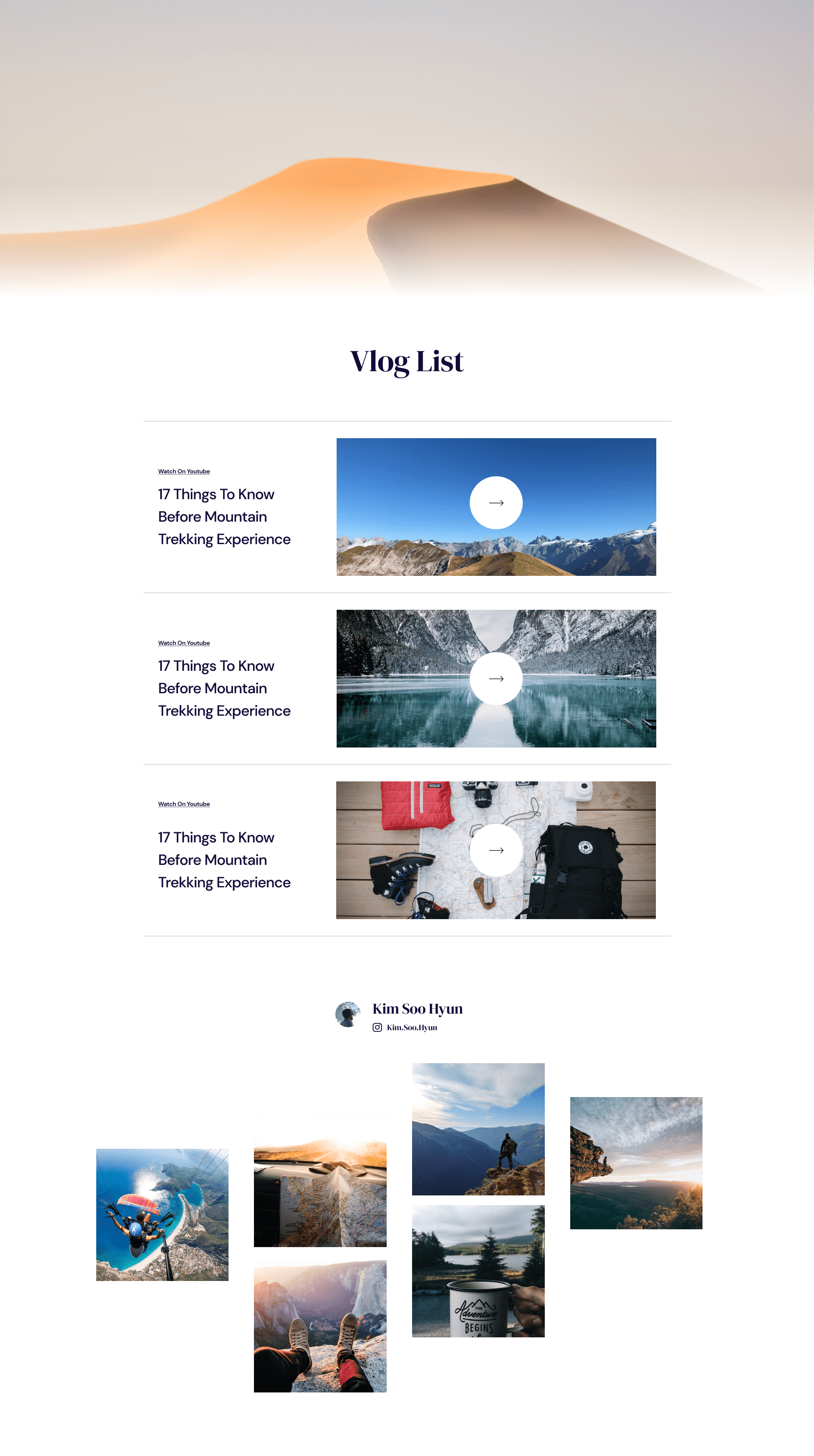
The vlog list page displays your vlogs and articles with outbound links to your youtube so viewers can access your vlogs with the click of a button. Viewers can also travel to your social media page from the bottom of the page.
Vlog Details
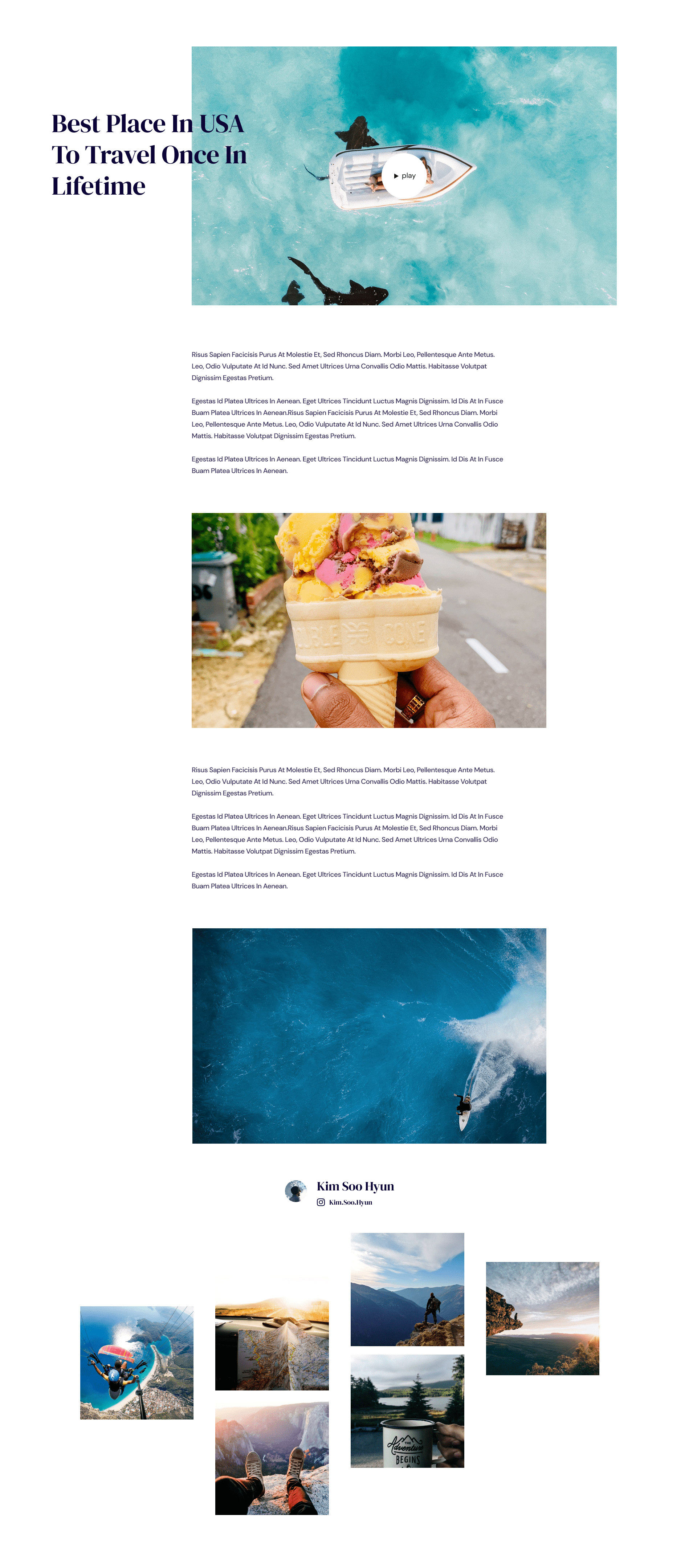
When viewers visit one of your vlog posts from the vlog list page they come to this intricately designed page detailing your amazing travel blog. You can add highlight images in between texts describing a particular tour snippet to your viewers. An embedded player plays your vlog directly on this page for your and the viewers’ convenience.
Product
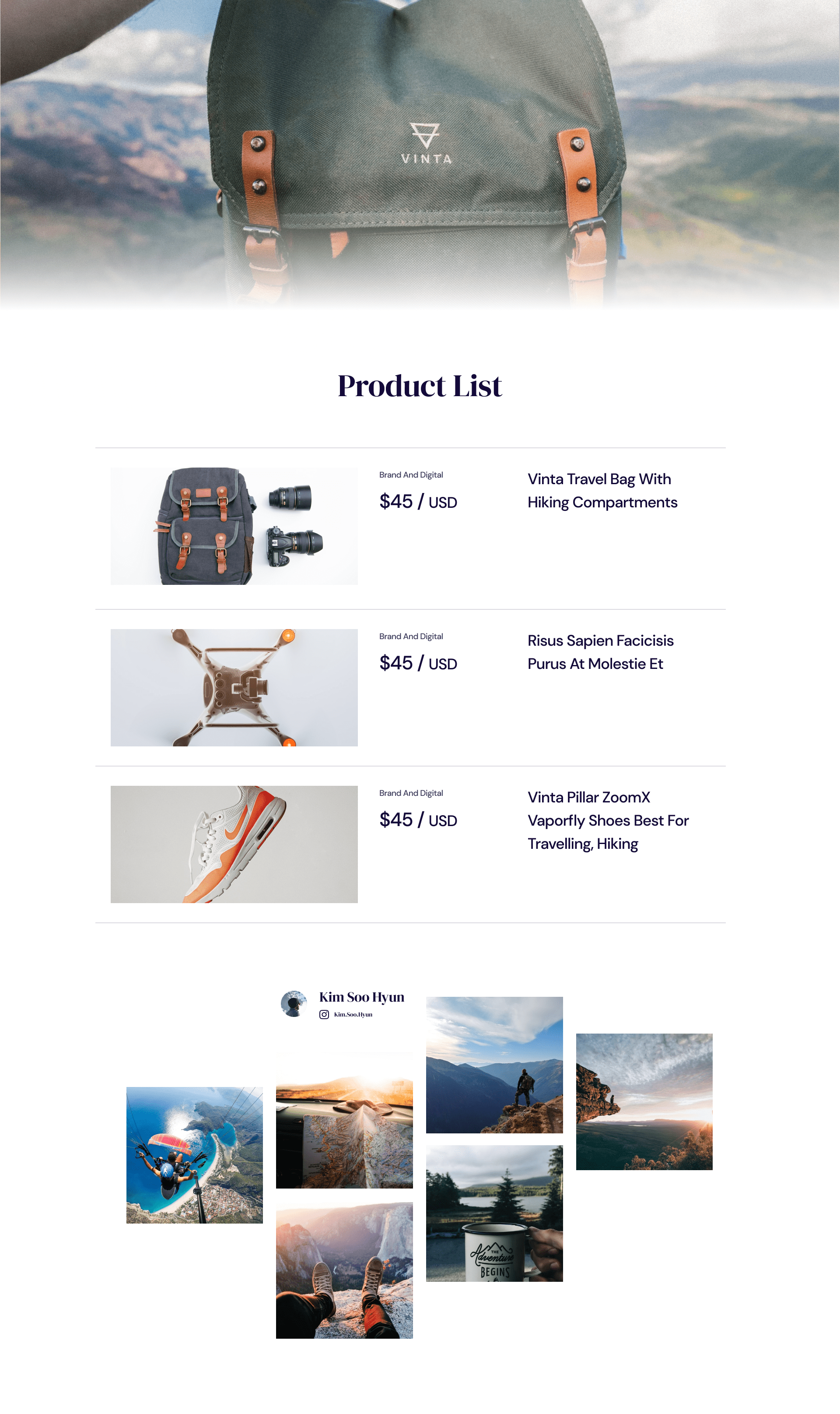
A quick overview of your products, viewers can see snap details of pricing, product description and images. The viewer can click on an individual product that takes them to a page with the product details should they be interested to make the purchase.
Product Details
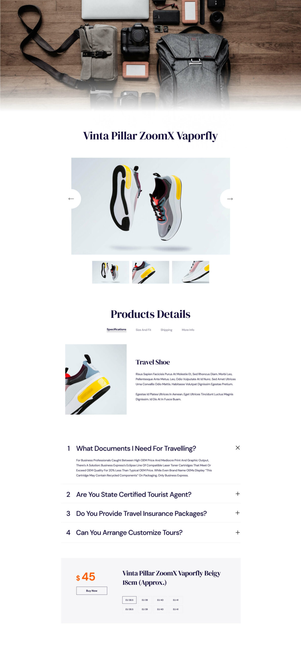
Dedicated detailed description page showcasing your product for your viewers. You can have a slideshow playing different images of your product for the customer to engage with. Add specifications, sizes, shipping info and all other info related to a product with ease and make it look smooth like butter. A wonderful travel tip faq section also helps viewers answer a lot of questions they might have about travelling.
Masonry
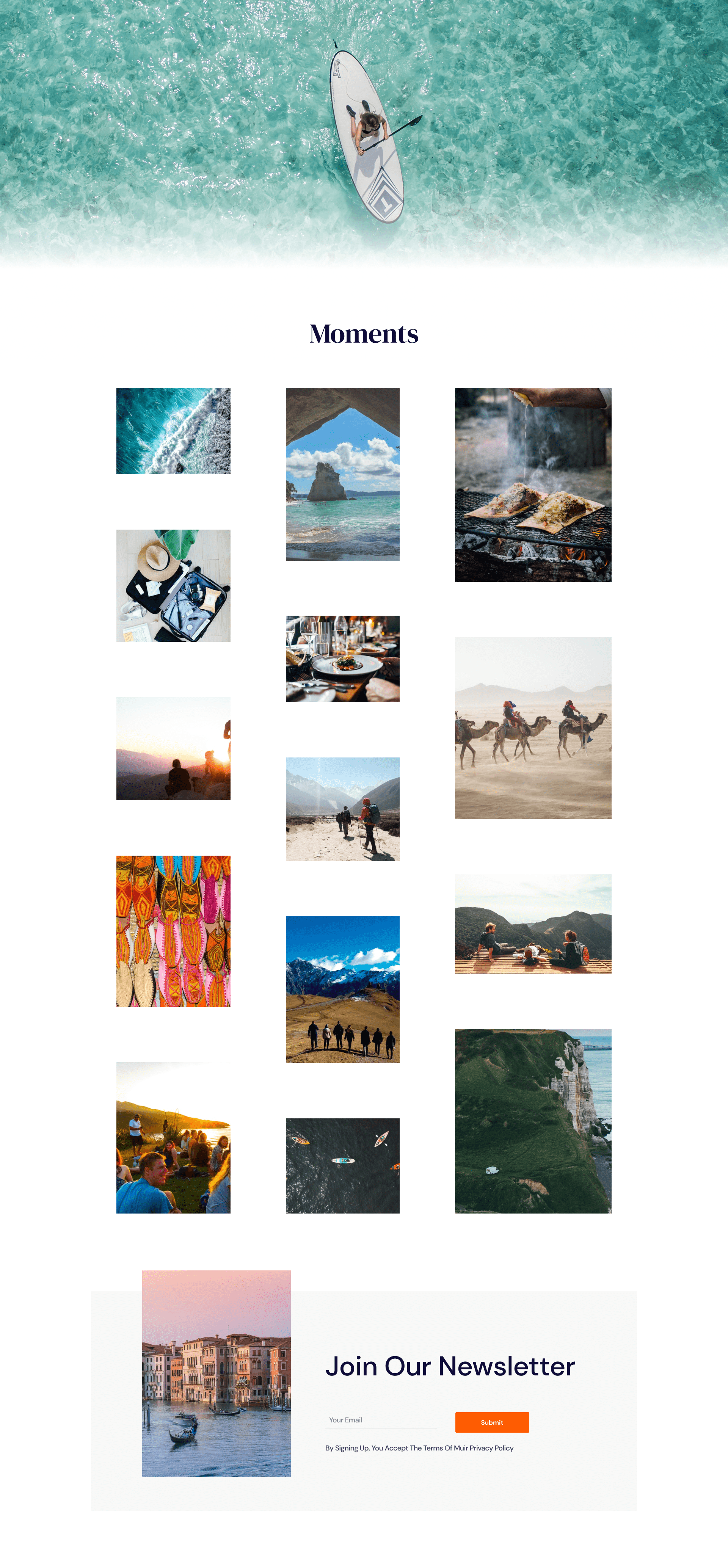
An excellent page to put all your favourite travel moments up for viewers to see at one glance. Fill the page with all the unique moments from all your travels.
Classic
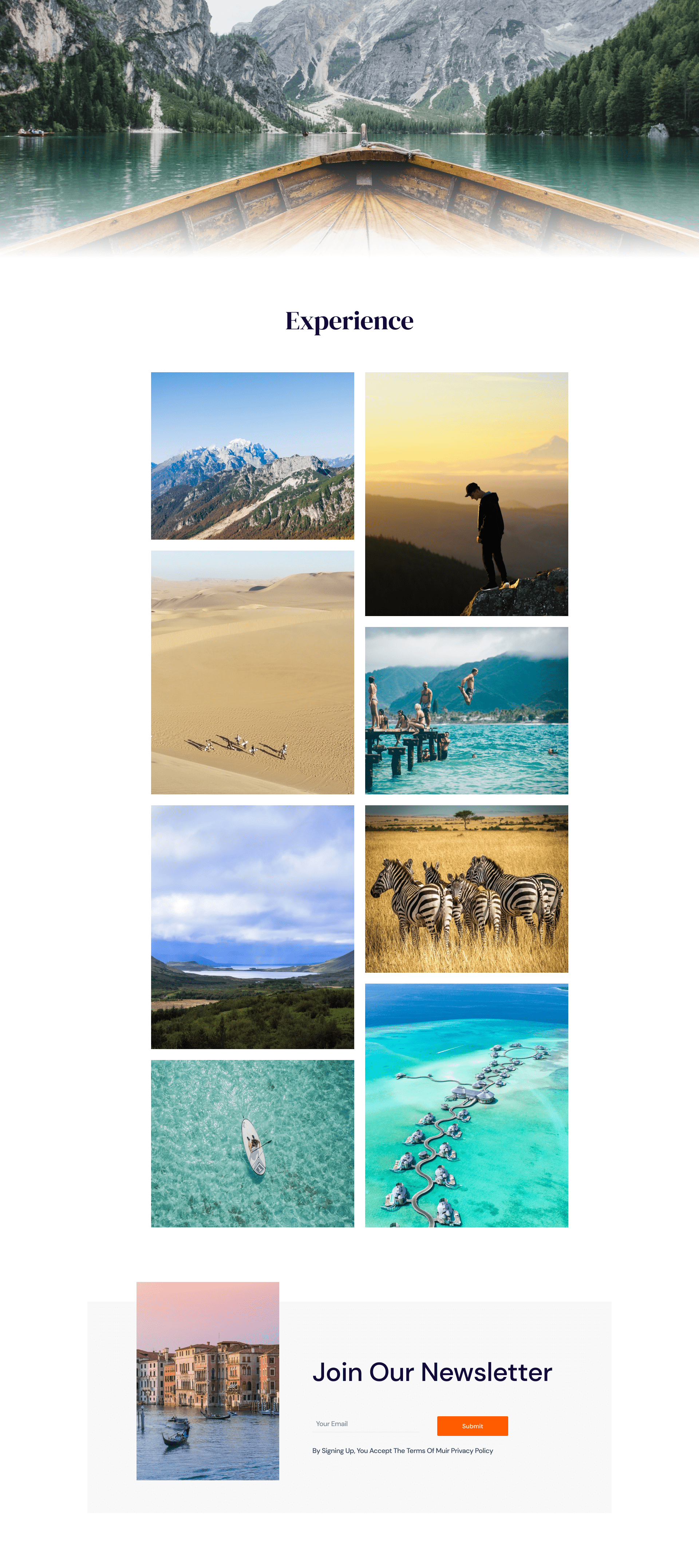
Feel like showing off the amazing experiences you have had around the world? This is where it all comes together, filling your viewer’s minds with amazement as you exhibit some of the best experiences to be had around the world as they travel. Surely they will be itching to learn more about the nitty-gritty of travel after this.
About Me
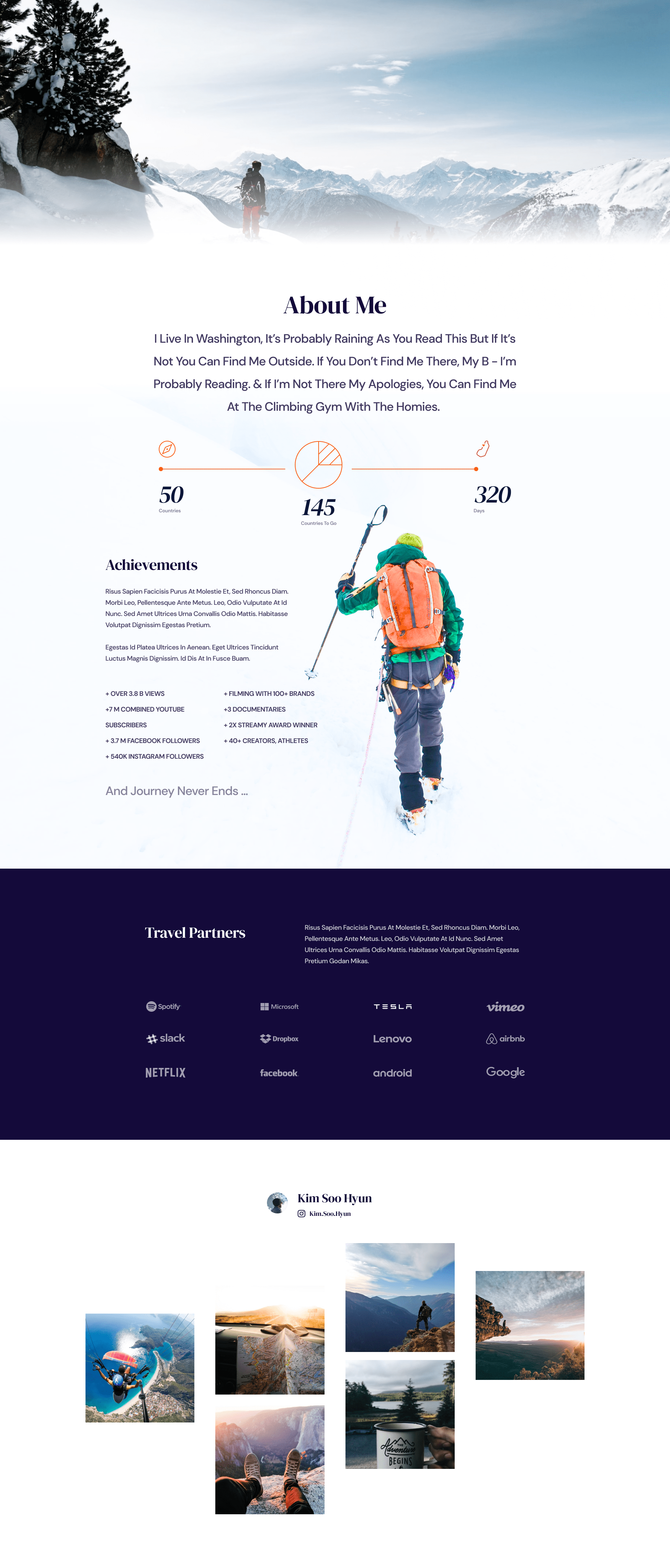
Let your viewers know who you are and what you do. An amazing hero section can display the best photo of you, exhibit your amazing achievements to increase credibility with viewers. The bottom section can alert your viewers on who your travel partners are. All of this is very pleasant and has an easy on the eye layout.
Business Contact
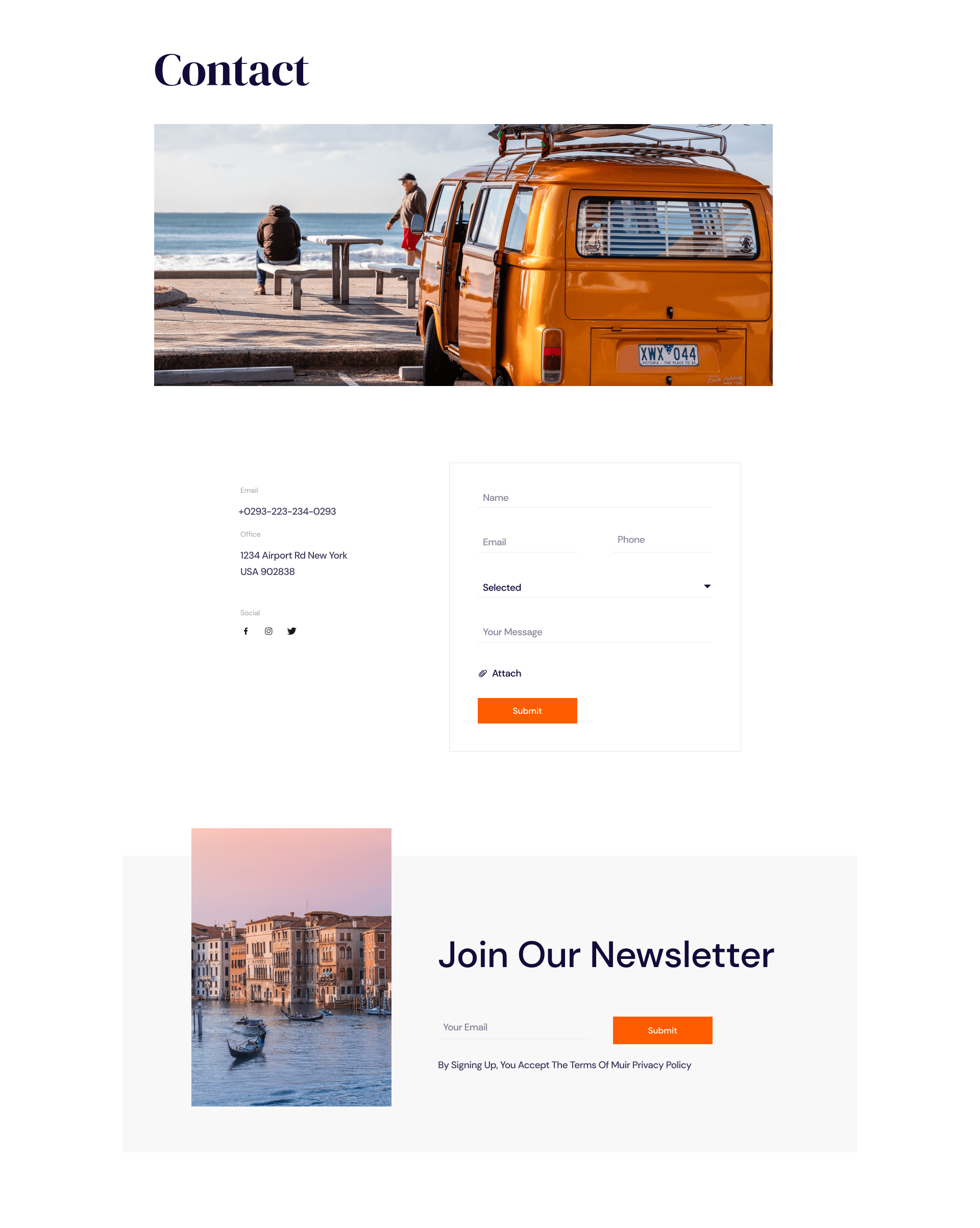
Have a contact page with all your information and a form that lets your viewers connect with you. Viewers can input their information and send you a message with utmost ease, a small scroll down the page and there’s another well-placed option to join your newsletter.
How to Access The Wanderlust Starter Pack?
Every Qubely Pro user can access this “Wanderlust” starter pack for free. To begin using it, all you need to do is update to the latest version of Qubely Pro. After that, add a new page and click “Import Layout” at the top. Now, search for the Wanderlust starter pack, select a page, and click “Import.” For every page, repeat the same steps. After that, add your custom images and text to the pages to truly make it your own.
Let us know what you think about Wanderlust and how you plan to integrate Wanderlust into creating your travel-centric website.

