As a scenic and fairly safe sport, scuba diving is getting extremely popular among adventure lovers. Today, it is not limited to a passionate hobby only, people across the world accept it as a source of income, either as a part time trainer during holiday seasons or as a full-time business.
If you are a certified scuba diver then you also have the potential to train people and build a great network while making some cash as well. After all, what’s better than to witness the shore of the ocean and explore the exciting marine world?
For those who are working as a freelance scuba instructor, own a professional scuba diving school, or planning to start their business, a professional-looking website can level up your game here resulting in a good number of clients to get your services with confidence.
Not to worry, if you do not have the time to build out a website from scratch with detailed info about products and services. Qubely is here with its brand new starter pack, “Scuba Diving” to ease your job.
So, without further ado let’s dive deep into today’s article to find out what this captivating starter pack has to offer you.
Special Features of Scuba Diving
The scuba diving starter pack is crafted to make it inspiring for your web viewers to getting up close with the wonders and the secrets of this marine universe. With a contemporary design, quick loading time, and optimized Qubely blocks we attempted to maximize the potential of your business while keeping the interaction alive.
Now let’s explore below to find out what special elements scuba diving contains inside:
- Amazing design and modern UI
- Seamless appointment form
- Video segment
- Dedicated pricing page
- Interactive sliders with hero section
- Detailed service showcase
- Creative image gallery
Pages Inside the Scuba Diving
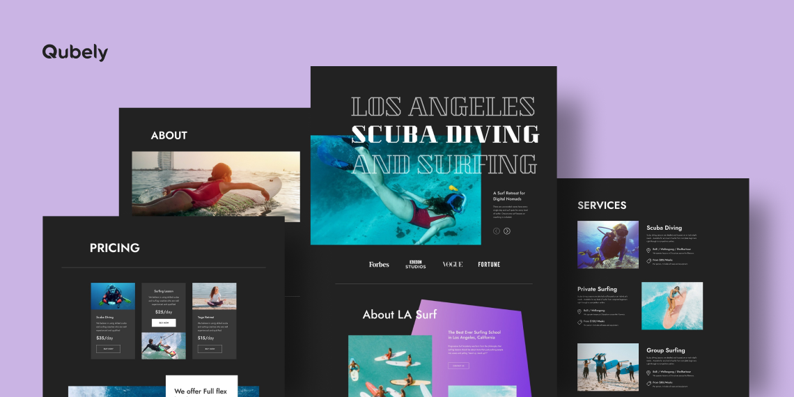
Scuba diving is an exciting way to explore the fantastic underwater world mystery and sea world. With hero sections, sliders, widgets, lively background, and many more shiny elements, we tried to bring the exact atmosphere in an immensely visually appealing style in each of its pages.
Before diving deep into the detail, let’s see at a glance what this starter pack contains inside:
Now let’s have a detailed glimpse of each of its pages below:
Home

The home page of any website can be the key to pleasing the audience. Even it can make or break you. In a warm and bold color shade design, we tried to make it an eye-pleasing feast for your audience. As soon as the audience will hit this page a classy font style hero section will capture their eyes at the first glance. Sporting highlights of your services, sliders, several image galleries, contact us CTA, and booking button, the page has a lot to keep the viewers scrolling.
About

Services
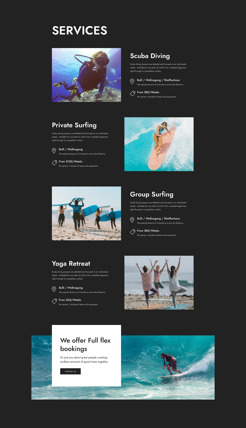
The services page could be the right trigger in generating new prospects and leads. Breaking up each of the services into smaller chunks including visuals, title, package details, and keeping sufficient white spaces this page brings all the service information at your users’ fingertips. Last but not the least, online booking CTA is there at the bottom to give your audience a seamless reservation experience.
Image Gallery
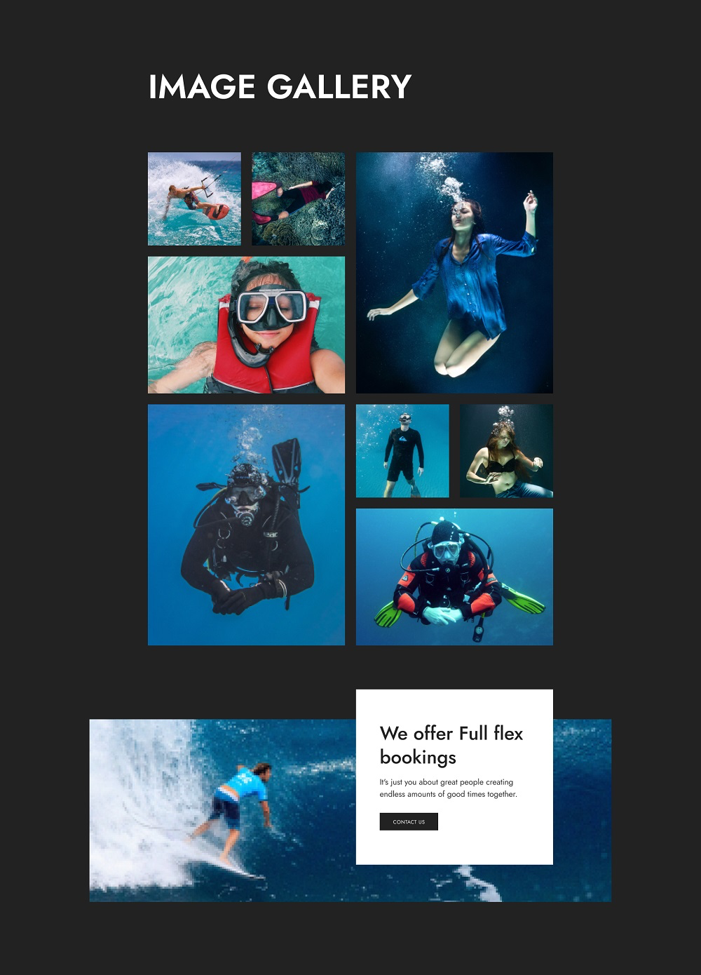
A well-placed photo gallery can tell the story in a single glance, much more efficiently than words can. Applying a stylish format in an intense color background, this page is crafted to grab your users’ attention and guide their eyes across the page.
Pricing
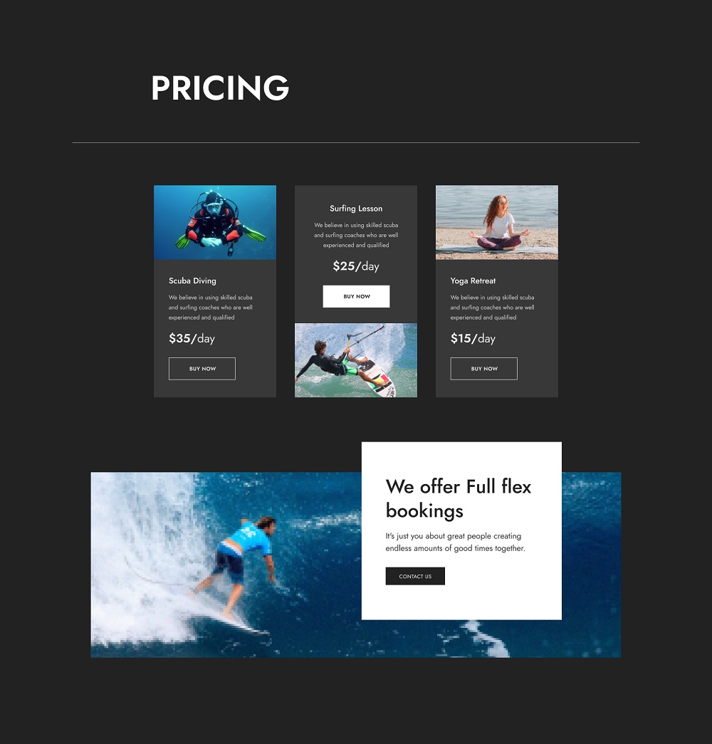
A professional looking pricing page ensures more sales and conversion. Put as much information as possible on the pricing page so your website viewers know the benefits they’re getting, and the price they’ll have to pay. By breaking down your pricing plan in different sections with CTA’s you can push your audience to turn into potential leads. Moreover, you can also showcase an appointment form at the end to divert your potential visitors to the next level.
Contact
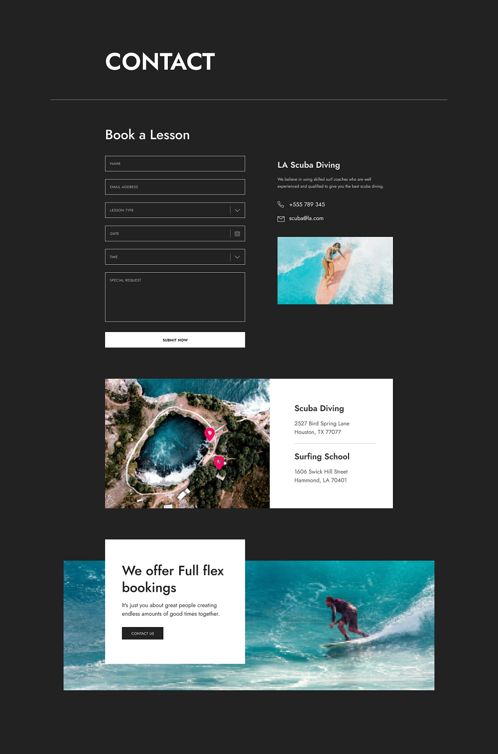
User experience plays a vital role in any website, especially in the case of a contact us page. The more simple and clean it is, the better the user experience is. With a self-explanatory form, image display, physical location, and service reservation CTA the page meets all the contact details so your viewers can find it useful.
How to Access The Scuba Diving Starter Pack?
Every Qubely Pro user can access this “Scuba Diving” starter pack for free. To begin using it, all you need to do is update to the latest version of Qubely Pro. After that, add a new page and click “Import Layout” at the top. Now, search for the Scuba Diving starter pack, select a page, and click “Import.” For every page, repeat the same steps. After that, add your custom images and text to the pages to truly make it your own.
Wrapping Up
When it comes to scuba diving all surfers seek quality. To give your prospective clients a reason to believe you, and ensure you get more number of calls a website could be a powerful marketing tool here. With the visually appealing interface, minimal load-time, and easy navigation of the scuba diving starter pack we ensured that you can reach the top of the ladder among your competitors. So, if you like to give your scuba diving business a top-notch impression and increase your chances to get hired, it’s time to dive into Qubely and explore your opportunities. Good Luck!

