Qubely’s Row block helps quite literally create the structure of whatever you are building with Qubely, and in extension, Gutenberg as well. At its core, it’s a block that holds other blocks and can control the portion of space that each inner block is allocated. But for the purpose of web-design using Gutenberg and WordPress, the Row block does a lot more than just holding other blocks.
What Sets It Apart From the Default Gutenberg Column
By default, Gutenberg comes with a similar block called Columns. It and Qubely’s Row block have similar purposes in terms of functionality. But when it comes to in-depth customization, you might find that the column block is lacking in some sectors. Let’s take a look at the places where the Row block improves upon the Columns block.
| Category | Gutenberg Columns | Qubely’s Row Block |
|---|---|---|
| Background options | Solid color and Gradient | Solid color, gradient, image, videos |
| Animations | Unavailable/Available using CSS | Supports animations and interactions |
| Size and spacing settings | Unavailable/Available using CSS | Available in the block settings |
| Proportion control | Using block settings | Using block settings and visually |
| Custom size | Unavailable/Available using CSS | Using boxed setting |
| Responsiveness | Auto | Customizable |
| Content alignment options | Unavailable/Available using CSS | Vertical alignment |
What Is a Row Block
The Row block creates the backbone and skeleton of a page or post created using Gutenberg. You can use it to control the amount of space the inner blocks hold, add backgrounds, apply grouped animations, and so much more. Let’s take an in-depth look at some of the features discussed above.
Full-Width Builder
Unlike the default Column block from Gutenberg, you can use the Qubely Row block to create full-width pages. While the default block allows you to go full-width, there is no option to customize its behavior. This is where Qubely Row block shines. You can customize the padding, add a margin, and also set the height for the block.
To enable full-width builder, you have to select Full-Width from the context menu of the Row block. After that, the block will become full width and will span the entire size of the canvas.
You can also select Boxed from the block options which will allow you to pick a custom width for the Row block.
Multiple Background Options Including Video
Default Gutenberg Column allows two kinds of backgrounds: solid color and gradient. We’ve upgraded that to add two more options for images and video backgrounds. This will let you add a livelier web experience
To add a video, simply click on the video icon in the background options, and then either upload your video locally or insert the URL to a hosting website. If you are using all locally inserted videos, you can compress them using Handbrake, a video transcoding software to optimize size without losing quality.
Another cool thing is that you can add background overlays so that a layer of color will be placed on top of the background you chose.
Customizable Columns Inside Each Row
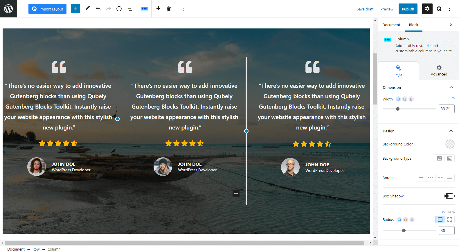
Each column can be individually customized to perfection using the block settings tab. You can edit its background to add either a solid, gradient or image background. You can add animations to columns individually to create a more complex animated effect.
You can also change the size of each column by changing the value of the Width slider. This is a responsive function as well. There is a slider in between each column that you can drag to adjust your page visually.
A Few Use Cases of Qubely’s Row Block
Let’s take a look at a few inspirational designs from our own starter packs.
Hero Section
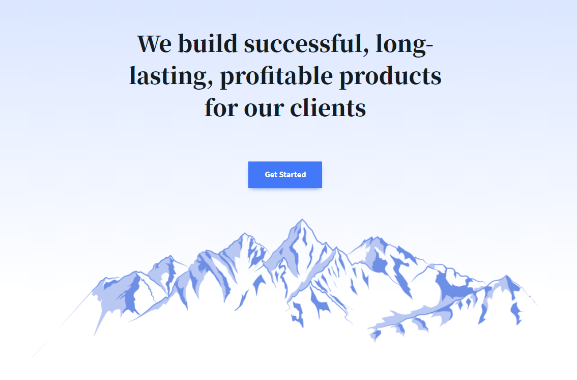
Using a Row block with one column is a very simple yet effective way to create a Hero section as we’ve demonstrated here. You can simply add a gradient background or go for a media background as well.
Gallery
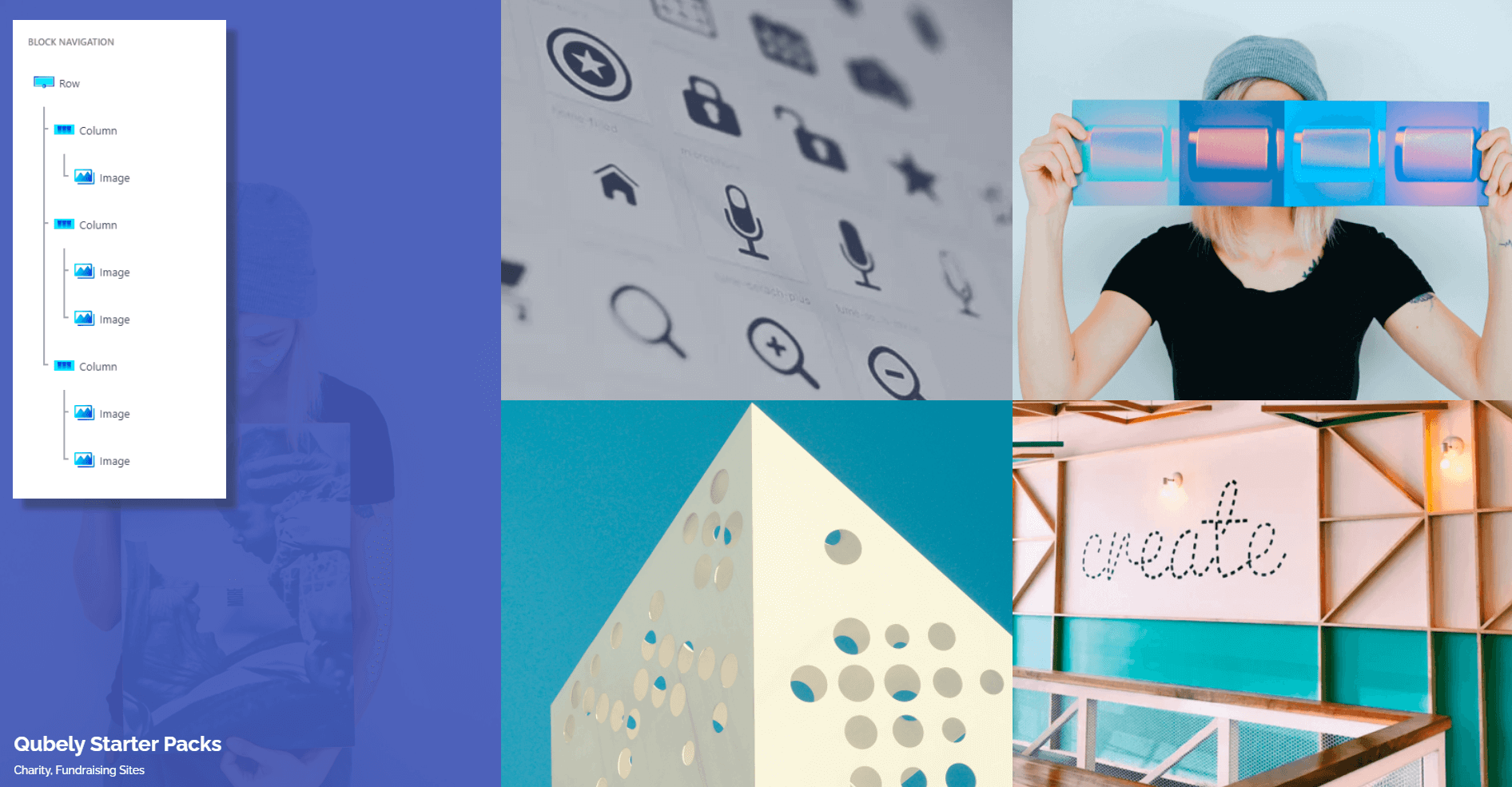
Using the simple yet flexible designs you can quickly add images to any of the blocks and orient them in the way that you want. Here, we’ve used a 3×2 design with one image taking one whole column while the 2 other columns are split into 2. The combinations are literally endless.
Team and Testimonial Sections
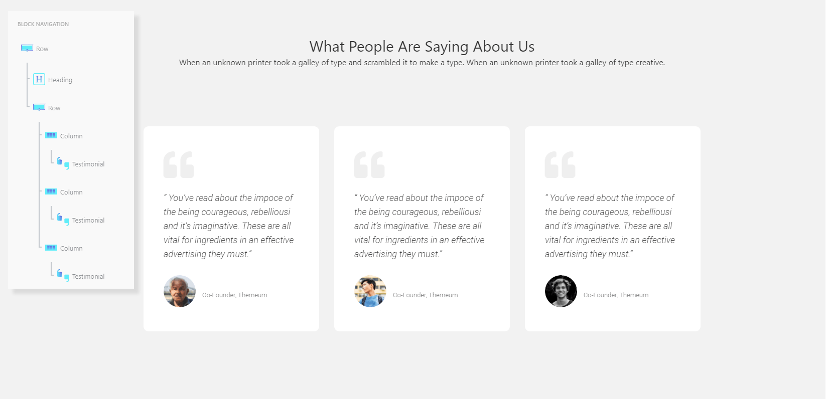
Don’t care for carousels or auto-rotating sliders? Use the static rows and create an influential testimonial section easily. You can also showcase team slots and assign them specific backgrounds by adding to the column background as well. One cool thing too, is that you can add animations on a per-column basis so each element can move independently to each other.
Contact Form Designs
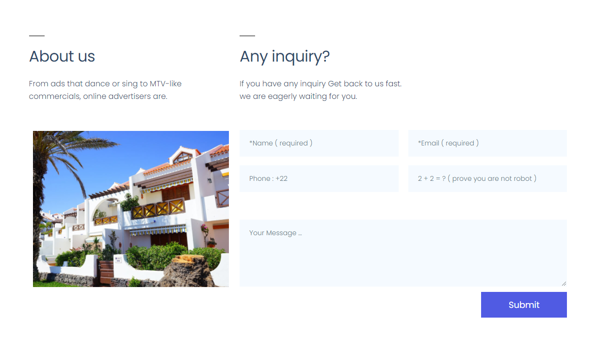
Tired of the basic looking contact forms that tie you down to one single design? Make your own with rows and columns.
Wrapping Up
All in all, the Row block gives Gutenberg an easy-to-use structure with a focus on the new users. Alternatively, it also holds features that an avid web designer will be able to make full use of.
So, what do you think about the Row block from Qubely? Does it add more flexibility to your website? If not, have you noticed a feature that could be useful on your website? Let us know in the comments below!



RenateBlaes
Thank you very much for these important informations! I just found here what I’m was looking for.
Best regards – Renate