Greetings, Qubely users! Hope you all are doing well in these troubled times. Even during these times, the entire Themeum team’s been working diligently from our homes to give you as much as we can.
In today’s update of Qubely, we’ve added several changes. These changes will most definitely enhance your Gutenberg editing experience. With an innovative new sidebar design, several readily available designs, and enhancements to Qubely’s core, we’re turning the dial up to 11 with Qubely’s development.
So, let’s not take your time and check out what’s new with the changelog!
- Update: All blocks – Major improvement in panel UI & UX
- Fix: Advanced Settings – Hide on tablet/hide mobile issue
- Fix: Row block – Full-width option not working in Twenty-Twenty theme
Redesigned Sidebar
The Qubely sidebar has been redesigned to have a more user-focused UI. We made sure the sidebar had precisely what the users wanted, while also keeping the in-depth settings accessible.
Please check the video below to have a quick idea of all about this update. You can turn on the sound using the playback controller for a better experience.
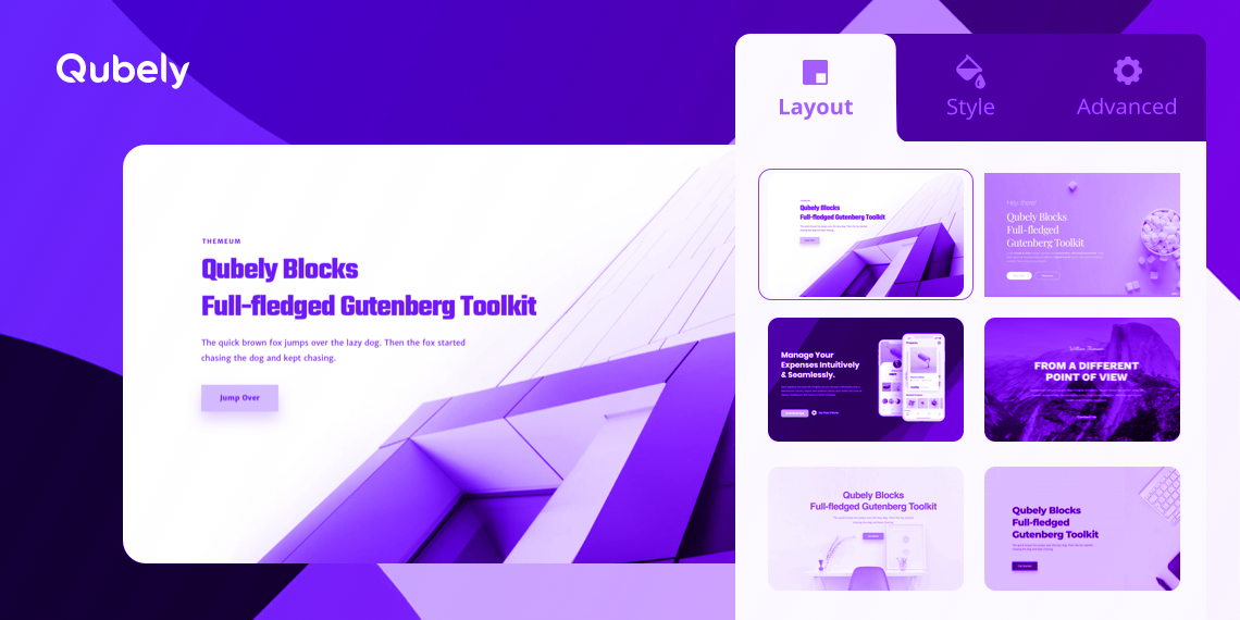
Instead of one single panel, the sidebar now contains two (in some cases 3) tabs: Layout, Style, and Advanced.
Layout: Easily Import Predesigned Blocks
This tab contains different ways you can import pre-designed blocks for your use. There are two ways to do so:
Design Templates
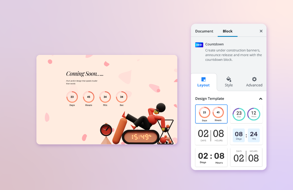
At the time of release, this tab is only available in about half of the Qubely blocks. It contains predesigned templates as well as related sections. Design templates are pre-built blocks designed by our team to make it much easier to use the blocks. Pick the design you like and bam! You have that block on your page. This tab also contains related sections.
Related Sections
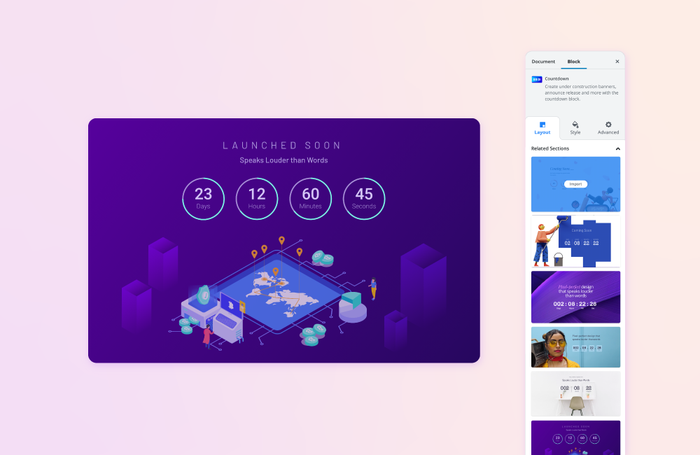
Related sections are Qubely’s ready sections that include the block you are focusing on. These will help you build a specific piece of your WordPress webpage quickly and effectively. Along with that, you get to see a use case of that block which will help you if you’re new to the world of web development.
Related sections are a more natural way of importing than the previous versions of Qubely, as locating the relevant segment is now more effortless. With one click, you can directly import relevant sections from the library of pre-built designs.
Style: A Streamlined Customization Experience
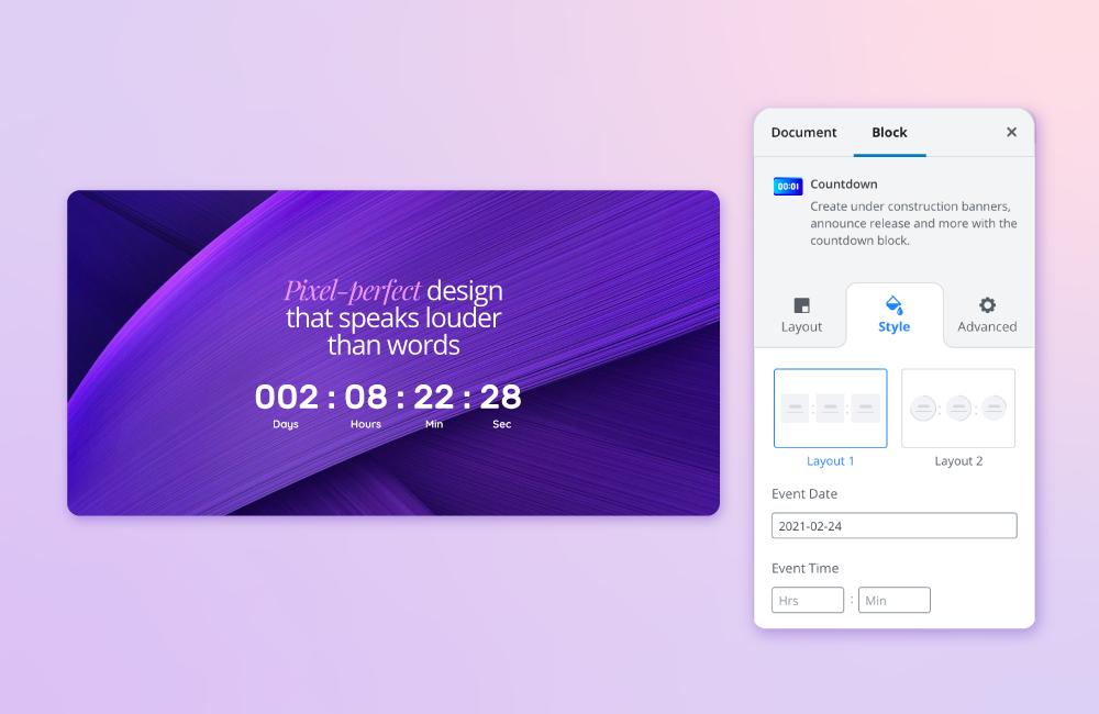
This tab includes all the styling settings of the block. From typography to colors, to data. Everything related to the visuals of the block is located here. Almost all settings tabs from previous versions have been moved to this tab. Each block will have different settings in this tab of the sidebar; for example, in the Countdown block, you have fields to change the styles of:
- Container
- Label Text
- Number Text
- Separator, and so on
If you want to know what each setting does, find the corresponding block in our documentation and learn.
Advanced: Powerful & Out-of-the-box Settings in One Place
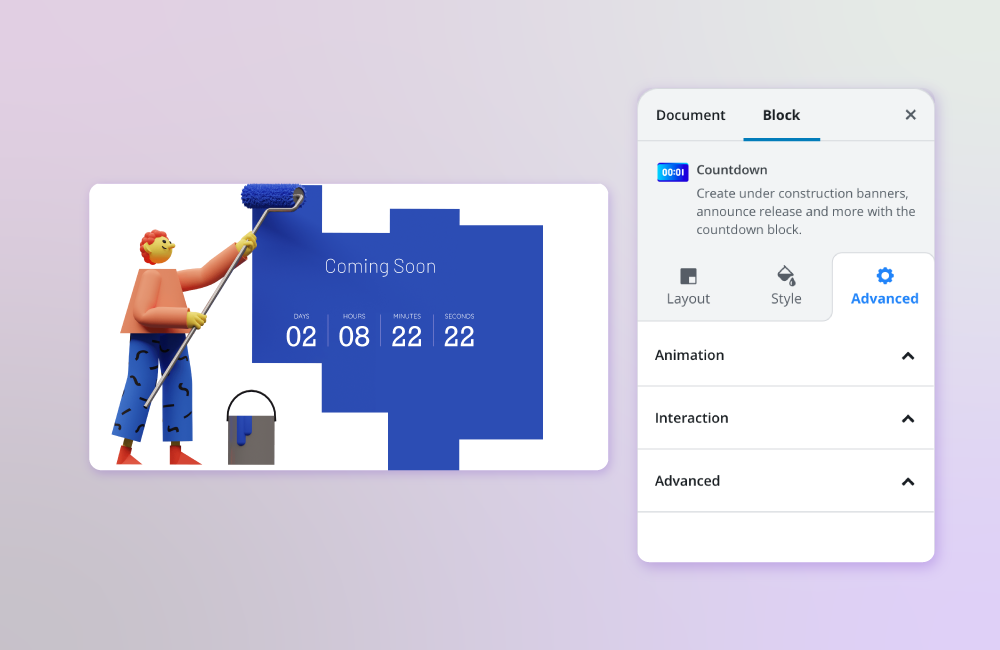
This panel includes all the advanced options of Qubely. We’ve moved the Animations, Interactions, and Advanced settings into this tab. Pretty straightforward.
Other Enhancements
We have also added other changes to the core of Qubely to enhance the user experience. Several issues that you reported have been fixed. For example, the hide in tablet/hide in mobile issue is fixed and this feature will work as expected. Also, the Row block now works properly with WordPress’s default Twenty Twenty theme when you set the Row block to full-width.
Wrapping Up
With Qubely, our goal is to not only create the most advanced Gutenberg toolkit but also create something that changes WordPress page building forever. Even with the upcoming release of WordPress, v5.4, the core WordPress team has emphasized Gutenberg more and more. And we want our Gutenberg block plugin at the forefront of this release. For this goal to be achievable, we need your help! So keep telling us what you like and what you don’t about Qubely. We’ll keep updating it to be the best in its class!

