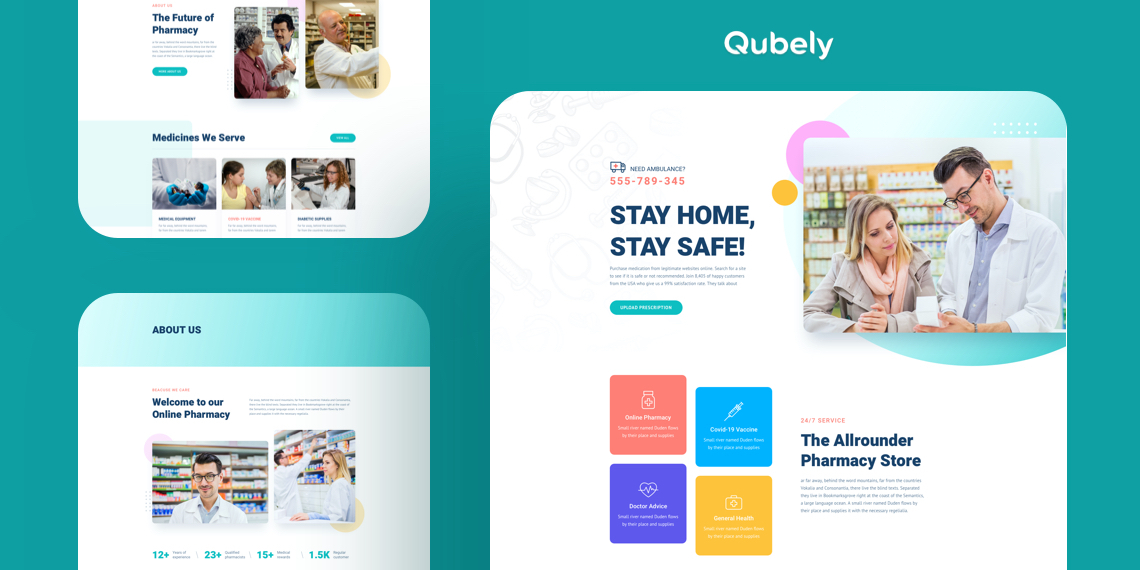
A significant part of business success depends on online visibility these days. It stands true for the pharmacy business as well. From a simple pill to any advanced health care products, people are turning to the internet for solutions to everything. This online trend has also raised the competition among the pharmacy enterprises. To truly stand out as a brand, you must make sure your audience knows who you are and what you have to offer.
As reaching out to anything has become a matter of moments, you can clearly understand how important it is to keep up with the current trends and getting a website. To put your work at ease, and ensure you have the best online presence today we’re here with Qubely’s exclusive free starter pack “Pharmacy”.
It could be the perfect gig for all the developers and pharmacy businesses out there who have been looking long for a solution to outshine others in the similar industry.
Without further ado, let’s jump straight into the details of the “Pharmacy” starter pack below!
Key Features of Pharmacy
The pharmacy starter pack contains chock full of features with an SEO optimized framework to rocket your site to the top of the rankings. Packed in a soothing design along with a perfectly adapted neat font style, this pack is all you need to create a professional online presence for your pharmacy without a single line of code!
Here we’ve listed some of the highlighted features of “pharmacy” starter pack below:
- Pleasing color-scheme with amazing graphic
- Clean & minimalist design
- Flexible & user-friendly interface
- Enchanting gallery display
- An interactive style of presenting contents
- SEO optimized
- A brief showcase of medicines
- Responsive with fast loading feature
- Effective contact form
Pages Inside the Pharmacy
Websites have become a rule of thumb for all the pharmacy business entities out there in this digital-heavy world. But, to recognize your business as a brand and getting closer to people with more sales numbers, a typical website is not enough. To truly stand out, you need to put an immense amount of focus on its online visibility too. With a stellar design and appealing style, the “pharmacy” starter pack of Qubely is purely a brilliance to boost engagement and conversions.
Before jumping into the details let’s have a sneak peek to its pages below:
Now, let’s get right into the pages and explore how it can give your business a perfect leg up!
Home
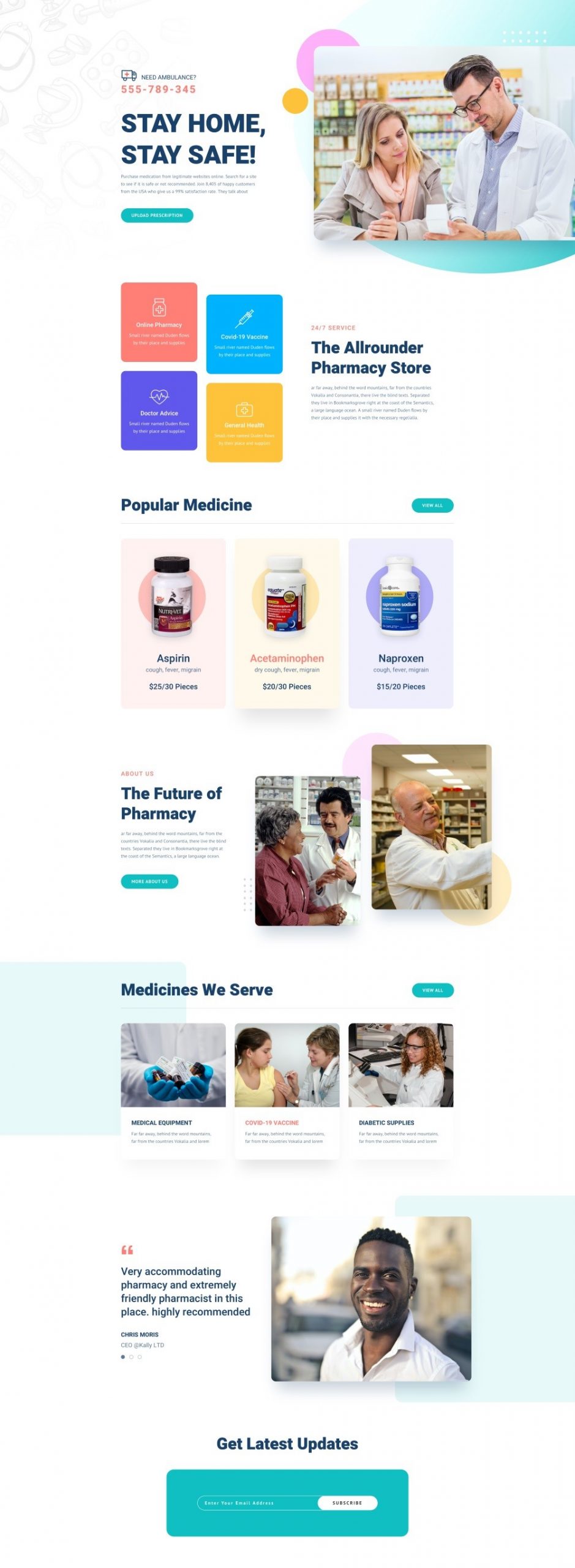
The homepage of your website has an immediate impact on people’s perceptions. We’ve showcased everything here in a way that tells your best story to your audience. This page sports a hero section with a CTA button to reach you, offered services, popular medicine highlights, brief introduction of the company, multiple CTA’s, testimonials, and newsletter subscription. Rest assured that this page could be a great asset for your business to educate the audience and drive traffic while creating a trustworthy impression about you.
About Us
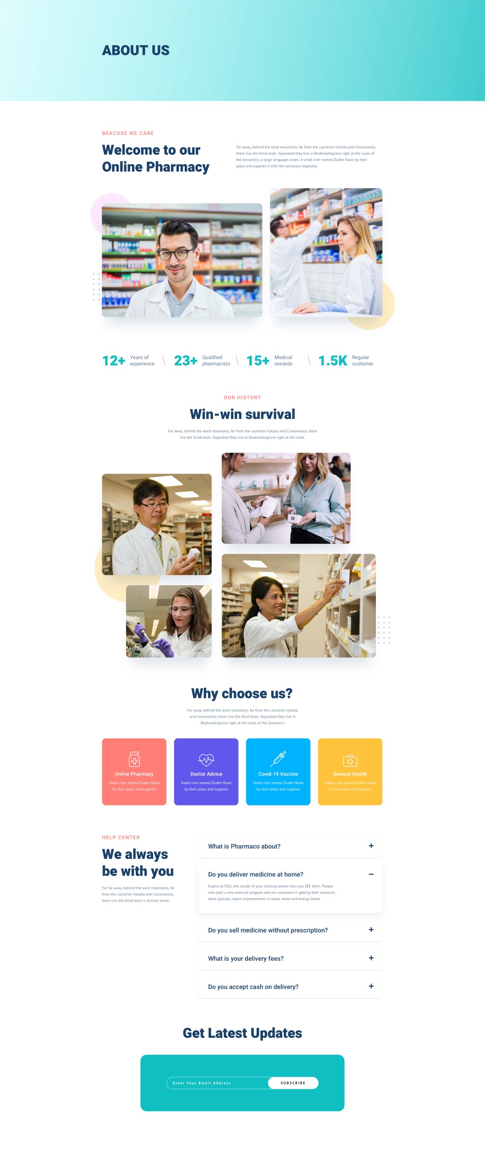
One of the most noteworthy parts of a medicine shop is to gain trust. We’ve tried to explain your journey, success & achievement with numbers and pictures clearly and elegantly to let everybody know about what your mission is and what you have to offer. An FAQ section and newsletter subscription options are also there at the end to provide in-depth information about your services and updates.
Medicines
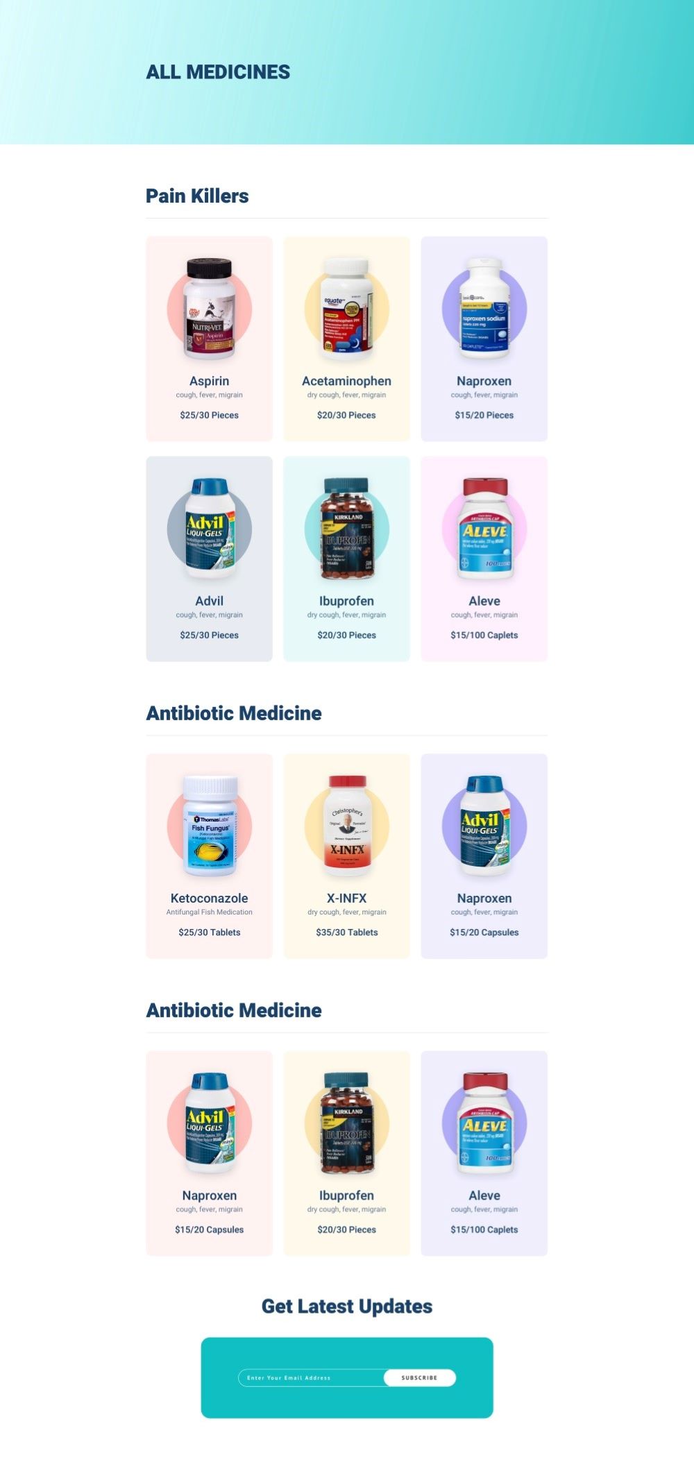
When people need to find any medicine, where do you think they’re going to look? Definitely in your medicine page. We’ve dedicatedly designed this page with a grid view to display your medicines to give off a clean and professional vibe. You can promote your medicines in a classified manner here with the name, uses, price, and pictures.
Medicine Details
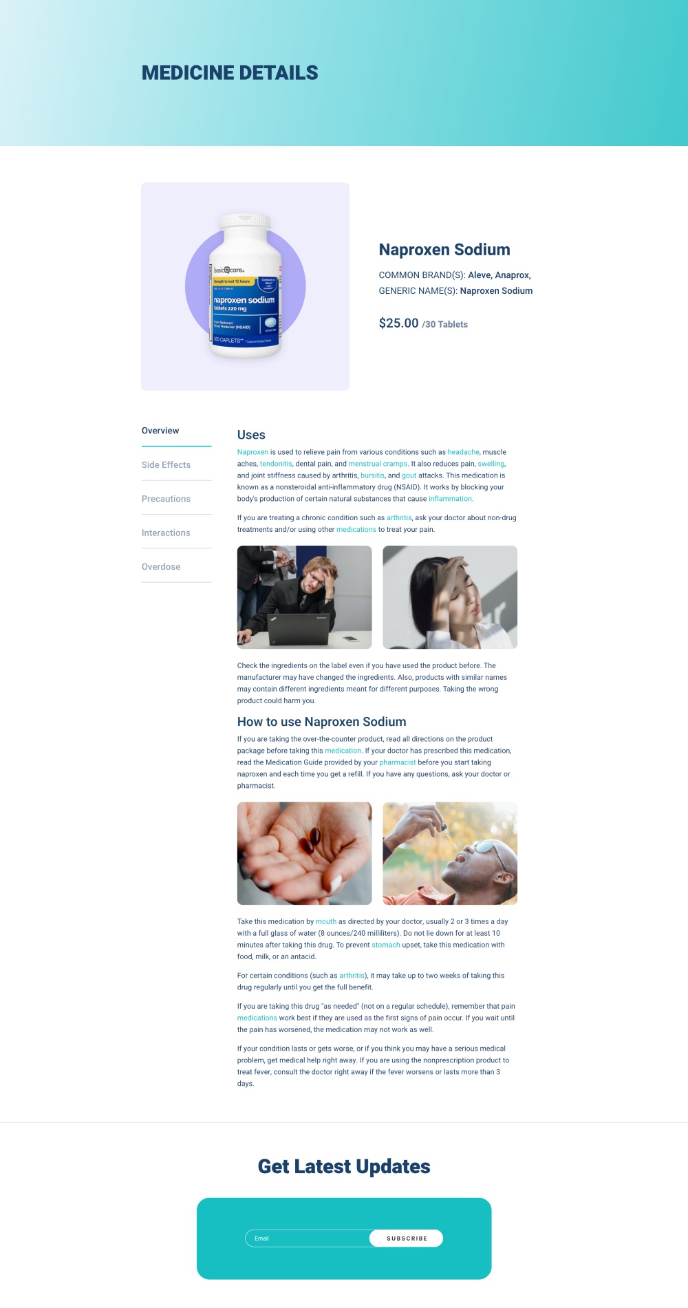
Your interested audience is more likely to scroll through this page. To ensure it rings true to them, and they find everything handy you can exhibit medicine details with pictures, overviews, purpose, and all other information elaborately here in separate tabs.
Gallery

Designed with a cool pestle color shade, the gallery page of this “pharmacy” starter pack could be a sure-fire way to keep your business in the spotlight. We’ve kept this page minimalistic with image and newsletter subscription features only so it doesn’t distract the user from the main content of the page.
Contact Us
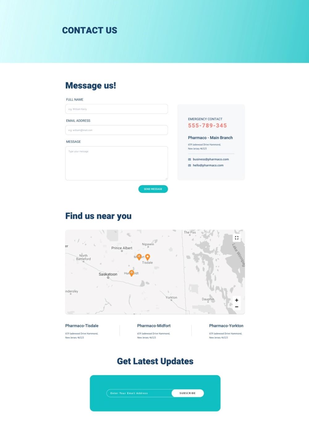
People look out for the contact page to reach you out. To ensure it meets their needs we’ve shown it with the right contents, and attention it deserves. Featuring emergency contact, self-explanatory form, email, google map, branch locations, and the newsletter subscription this page doesn’t miss out on anything.
Wrapping Up
So, folks, you’ve seen how this pharmacy starter pack can take your business off the ground, right? Now it’s time to get started with the action through Qubely. Don’t forget to drop us a line in the comments below to let us your opinion about the pharmacy starter pack, and we will get back to you in no time.

