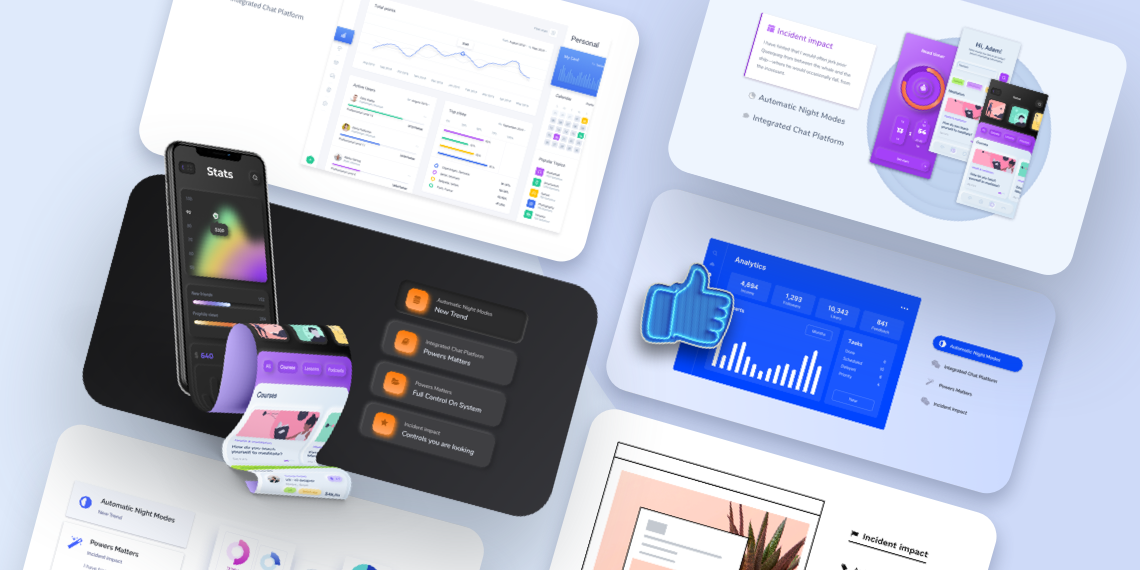
Introducing the all-new Vertical Tabs block for your favorite Gutenberg block toolkit “Qubely”. From now on, you can easily create vertical tabs with full customization on Gutenberg.
For the purpose of giving our users the best functional product, it was a necessary step. With the new Vertical Tabs block, you will get different layout options, the ability to configure the tab menu, text, set animation and more.
If you are not sure what the vertical tabs add to your website then let’s see a bunch of reasons on why you should have them.
- Easier to navigate compared to other forms of user interface
- Improve the way your content is organized
- Add visual consistency to the information on your site
Here you can check out the quick overview video of the new Qubely Vertical Tab block.
Qubely Vertical Tab Block: What’s Inside?
With the Vertical Tab block, you will be able to create any type of vertically tabbed design you can imagine. Let’s see in a glance on what you get.
- Choose from a predesigned set of layouts to get started
- Define how you want the tabs to look like
- Set the text/subheading section just the way you want
- Add any block to the body section of the tabs
- Create vertical tab menus that are unique to you
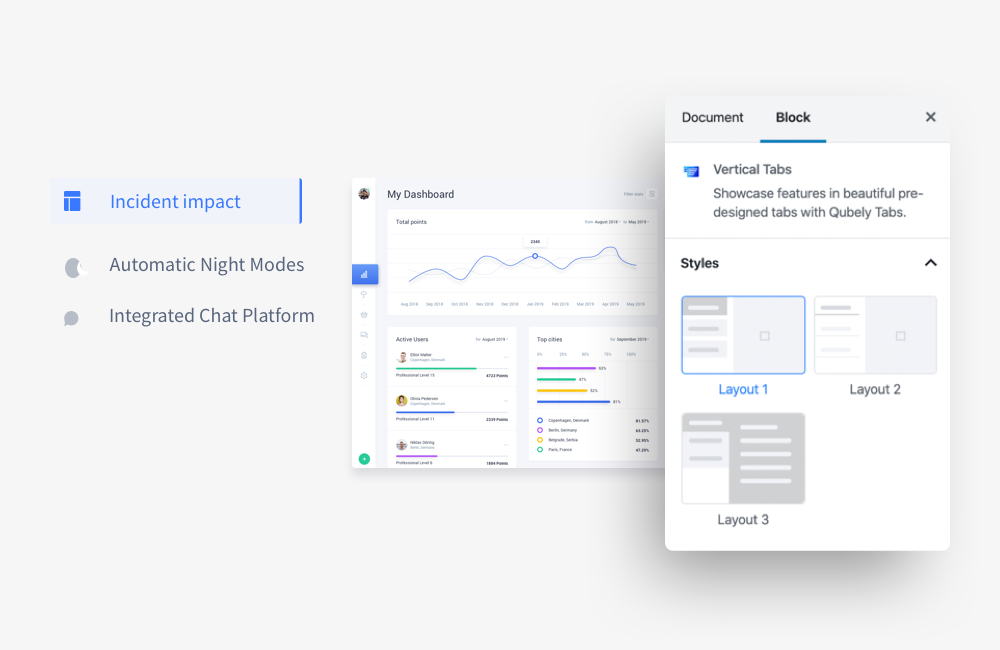
Pre-designed Layouts for Your Convenience
There are several preset design layouts that you can choose from. They offer versatile design elements and are fully customizable. If you need a specific layout design you can easily configure using the available options.
One-click Vertical Tab Templates
To save your time, Qubely Vertical Tab block also comes with ready to use templates that are usable in a click. We want to make sure that our customers have the best tools & resources at their disposal. This is an effort to make sure that is true. You get 5 beautiful vertical tab templates to use on your site.
Just select a template of your choice, and you are ready to offer a robust vertical tab on your page/post. We have plans to bring more templates in the future. Check out the demo showing all the available Vertical Tab templates.
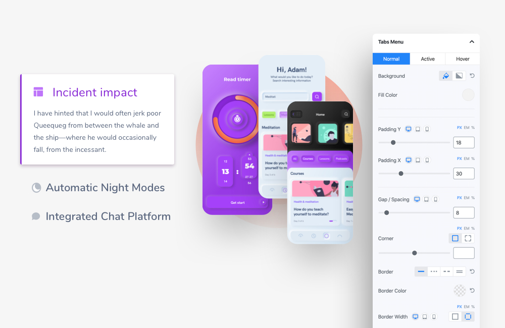
Configure the Tabs Menu to Your Liking
There are multiple customization options you can choose from. Set different colors including gradient type for the active state of a tab & also for the hover state of the tab. Define the corner radius value using a slider and specify the shadow of the tabs section in the Vertical Tabs block.
Customize the Text Label
In the new Vertical Tabs block, you can also configure the text label section of the tabs. You will be able to set different color properties according to the state. Such as a specific color or gradient type for active or hover state.
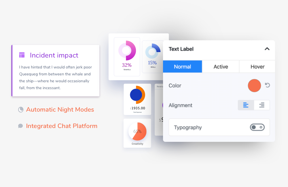
You can set the alignment of the texts inside the tab, enable icons/images for each tab separately. To add icon/image to your text label, enable the Nav Icon. There are also options to set how you want the icon/image to look like. From the specific color configuration, position in the tab section, size, the distance between the text and the icon/image, etcetera all are configurable.
Set the Subheading Details
You can also enable subheadings for each tab in the Vertical Tab block. Once you enable this, all the relevant configurations will be available. Set different types of color options for different types of states (such as normal, active, hover). You also have the ability to set the fill color or a gradient type.
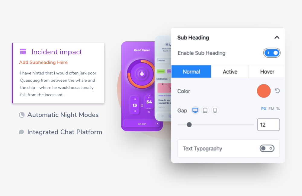
After that, there are also options to set the gap between a heading and a subheading. Enable Typography to define your Subheading’s type settings.
Add Accordions the Way You Want
If you want to add texts after the subheading section of your tabs in the Vertical Tab block then you need to enable the Accordion. Choose from 3 different types of states (normal, active, and hover) all over different types of customization options.
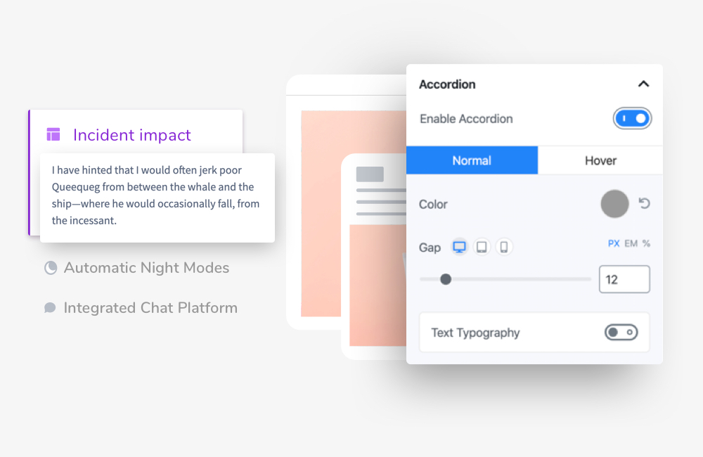
Set a specific color, the distance between the accordion text and the rest of the text content in the tab. If you want to add advanced typography to the existing accordion text you can do that too with the Advanced Typography option.
Configurable Tab Body Sections
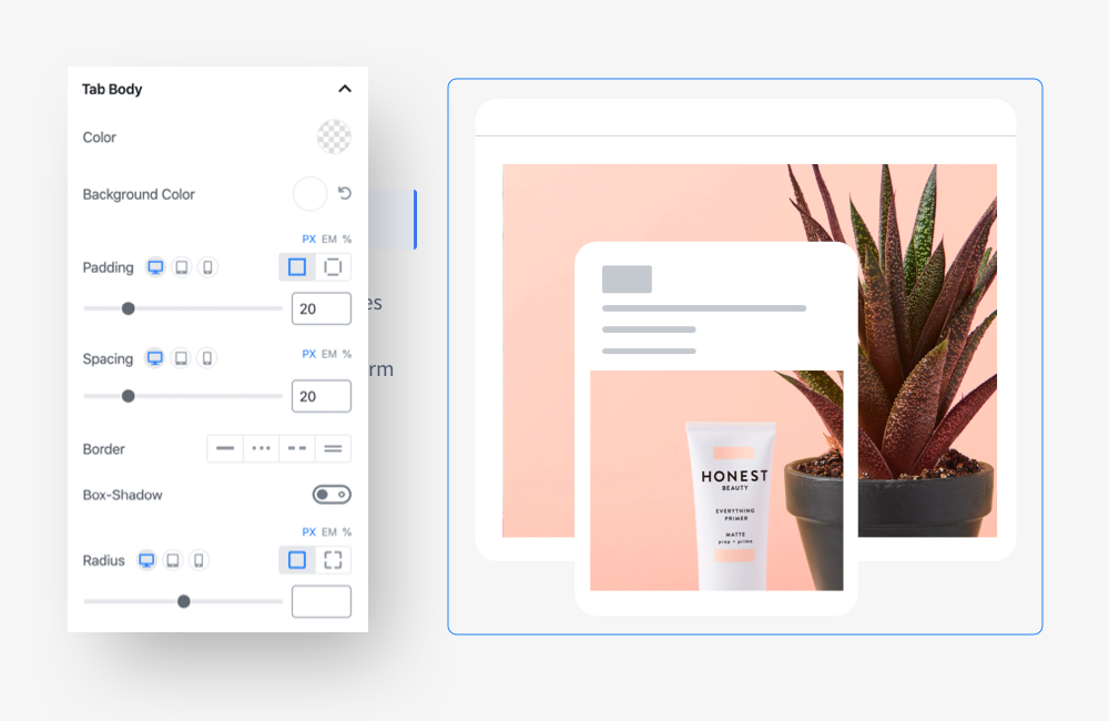
The body section indicates the section that appears after you click on a tab in the Vertical Tab block. You can choose the orientation of the body from the Styles menu. From this section, you can set the background color, padding, spacing, border color, border width, box-shadow, and the radius of the body section. All of these attributes can be configured to the way you like.
Full Changelog of Qubely Pro v1.0.9
With the latest version of Qubely Pro, multiple known issues were fixed addressing your feedback. Here is the full changelog of Qubely Pro v1.0.9.
- New: Vertical Tab block
- Fix: Form Builder block add new item issue on an empty column
- Fix: Testimonial Carousel block avatar height issue
- Fix: Testimonial Carousel block Box-shadow issue
- Fix: Testimonial Carousel block slider speed option issue
Tell Us What You Think
If you want to learn more about the Vertical Tab block and all of its features then you can always check out the official documentation.
Start using the all-new Qubely Vertical Tab block and share your experience with us. We are working hard to give you the best page building experience with Qubely. And for that, we need your feedback. Stay tuned!

