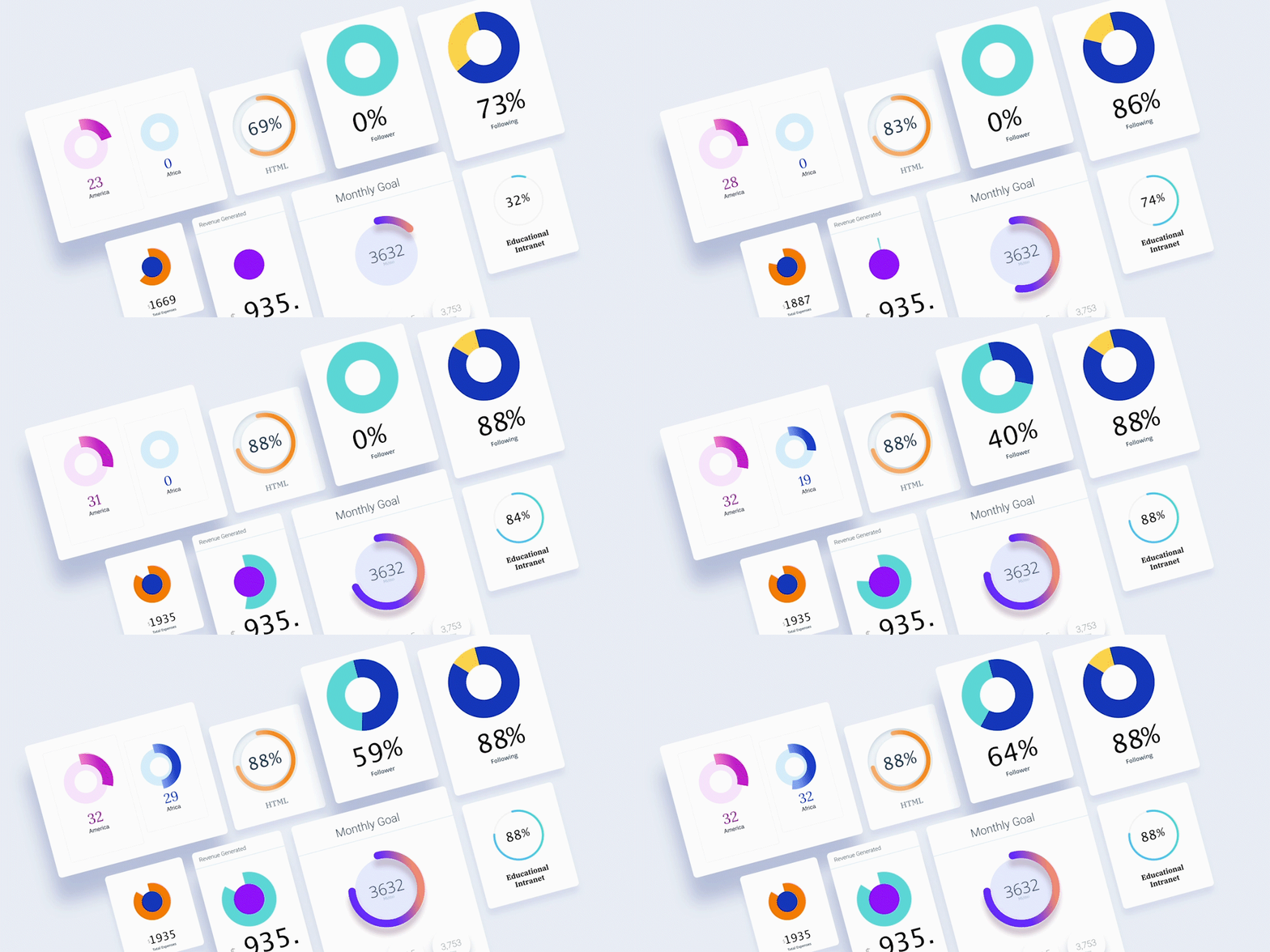
A circular progress bar is a great way to show complex information. It breaks down the complicated things and makes it easy to understand. Using it on your website can be really helpful to the visitors since the animation and progress indicator depict the information efficiently.
That’s where Qubely’s new Pie Progress Gutenberg block comes in. It’s fully customizable. Has different layouts for different formats. We are introducing the Pie Progress block with Qubely v1.2.7 release.
There are many use cases of circular progress indicators on your website. With the Pie Progress block in Qubely, you will be able to do the following (including but not limited to):
- Present the overall progress of any project
- Display the happiness rating of your customers
- Visualize your skill levels in different subject areas
- Display stats/dataset on web pages with animations
- Show resource usage on a dashboard/admin interface
The new Pie Progress bar is completely customizable, so it can suit your needs. There are 3 layouts for you to get started. You will find both circular and pie chart design layouts. Choose the layout you want to add to your post/page. After that, you will find the customization options for the layout design.
Design Freedom
The Pie Progress block offers a world of design freedom to the developers. You can design all the elements of the circle along with the progress bar. Define the circle width, the distance between the circle & the progress bar, the color of the circle, text/icon/image, and more. You can also set the shadow properties from the configuration settings.
10 Pre-designed Progress Bar Templates
We always strive for empowering everyone to build great websites. With the Pie Progress block in Qubely, you get another proof of this spirit. The Pie Progress block comes with 10 pre-designed circular bar templates so that you can add your animated progress bar(s) in the least possible time. Simply insert the block into your post/page and choose the suitable template from the built-in ones. Now you are ready to go with presenting your data on the circular progress bar.
We are working to bring the template feature on other Qubely blocks as well. Keep an eye on our site to know about future updates.
Simple Configuration System
This section will allow you to set the design elements for your progress bar. You can set the progress bar percentage amount, select the color of the progress bar. There are 2 types of color options to choose from. Fill type and gradient. Select if the corner should be sharp or round for the progress bar, set the shadow & width of the progress bar, and do more.
You can choose the time duration for your progress bar’s movement in milliseconds.
FiIl the Circle with Text, Icon or Image
You can better communicate with the visitors about the progress by additionally using an icon/image/text at the center of the circle. Once you enable this option, you will see icon, image & text options. For each different option, there is a different settings panel.
For icons, you can select from a wide range of available options. You can set the size of the icon along with the color.
For the image option, you can set the image size & the alt text for it. Also, it lets you upload a “Retina” version of the image for high-resolution displays.
If you want to use text in the circle, you will find personalization options for almost every part of the typography. From font family, font width, advanced typography, and more.
Heading for the Progress Bar
You can also set a heading for your circular progress indicator. Set the heading text, choose the position of the heading (from inside the progress circle or outside), configure the typography, select the spacing of the contents, and more.
The Last Pie Progress Builder You Will Need!
Qubely Pie Progress offers more customization options than it’s counterparts. Rest assured no matter what your requirement is, you can build it. From configuring its progress bar settings to applying a certain color to an element of the bar you can do it all.
If you want to know about all the existing features about this block, you can check out the official documentation.
Other Notable Improvements
With this Qubely update, we took multiple user feedback into consideration and improved upon. You will experience a more robust Gutenberg block building experience with Qubely. If you want to know the full changelog here it is,
Qubely 1.2.7 (Free version)
- New: Pie Progress block
- New: Transform function in CSS generator
- Update: Column block default UI
- Fix: Block control CSS issue for blocks inside columns
- Fix: Reusable block issue in rows
- Fix: Post Grid block – Excerpt issue
Qubely 1.0.7 (Pro version)
- New: Pie Progress block added (all layouts)
- New: Predesigned block template feature (all templates)
- New: Transform function in CSS generator
- Update: Column block default UI
- Fix: Block control CSS issue for blocks inside columns
- Fix: Reusable block issue in rows
- Fix: Post Grid block – Excerpt issue
Tell Us What You Think
You might have already realized we are releasing new versions of Qubely almost weekly. Bringing new goodies for our users. But this is only possible for your feedback. You are enabling these rapid developments by sharing your thoughts. Share with us your Qubely experience. What do you think about the new Qubely Pie Progress block?
And if you want to know the full capabilities of the Qubely you can always check out the following links.


