We are committed to making Qubely the most complete Gutenberg block toolkit. Multiple updates have already been released for Qubely as well as many new blocks. In keeping with that track-record, today we are bringing the “Media Card” block in Qubely- the most feature-rich and complete card block for Gutenberg.
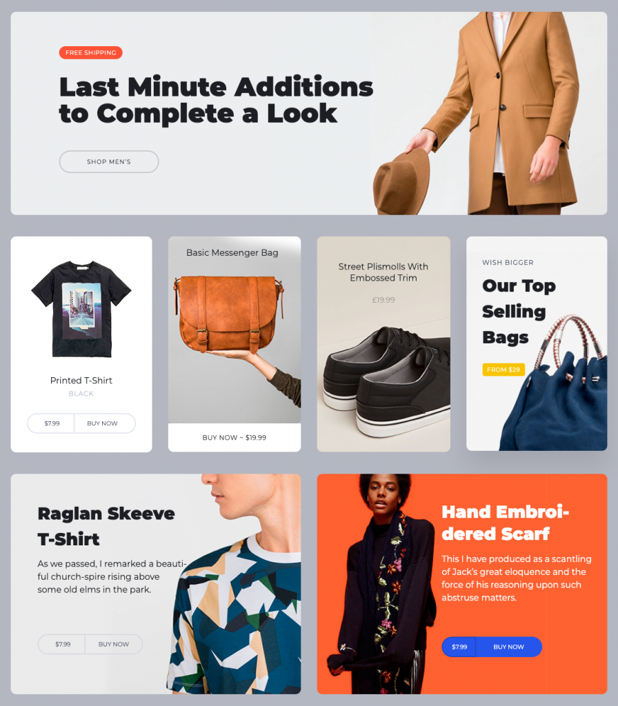
Cards are a great way to offer your audience the necessary information in a rich but simple layout. That’s why we are proud of introducing Qubely Media Card block.
Introducing Media Card- The Latest Qubely Block
With today’s release of Qubely v1.0.6, we are very excited for you to try out our newest Gutenberg block Media Card. This block will easily let you create any type of card block.
At a glance, you will get the following goodies in Media Card:
- 7 different layout options for your card design
- Option to insert other blocks inside Media Card
- Advanced card configuration settings
- Media settings
- Stack style settings
- Badge configuration options
- Customization settings (including animation, interaction, more advanced ones)
Qubely Media Card Functionalities
Media Card brings a lot of customization options that are extremely easy to understand. So that every user using the block can configure the settings to their exact needs.
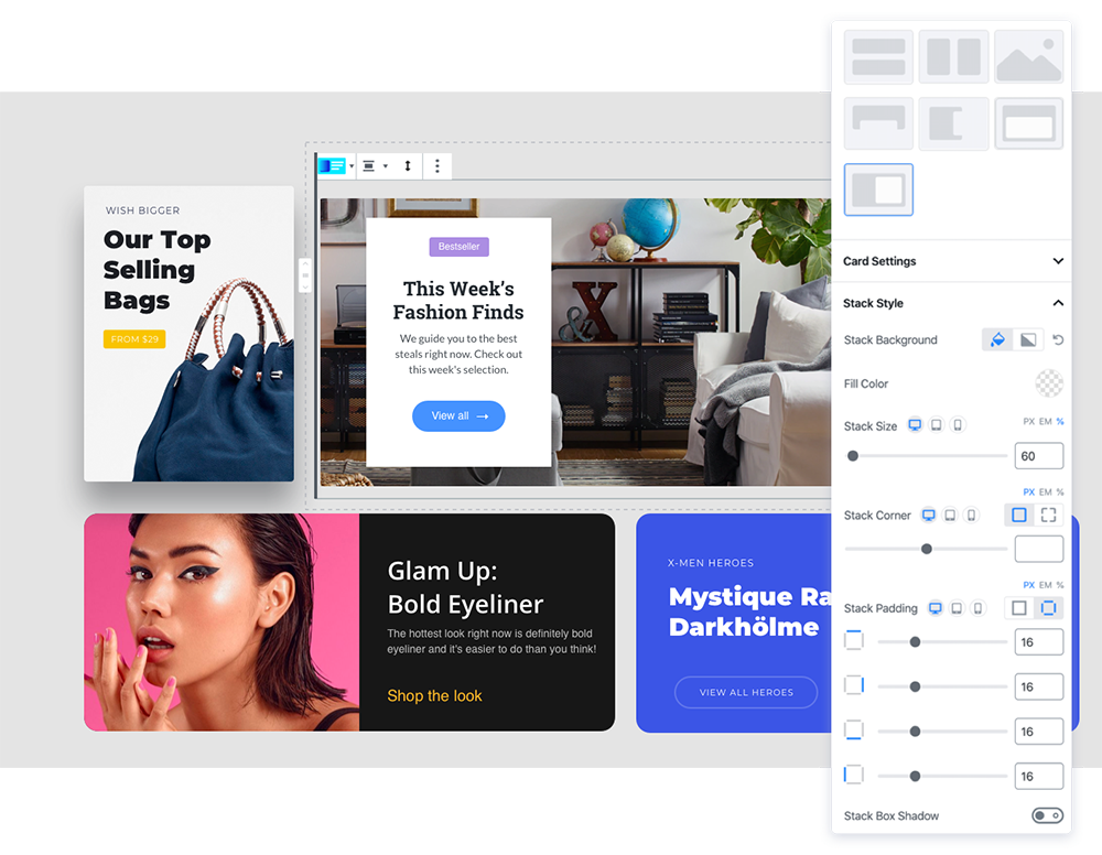
Once you click the block settings, at first you will find the option to configure the layout of your Media Card block. Currently, you can choose from 7 preset layouts. We are working to add more layout options for you.
If you want to learn in-depth about configuring the settings, don’t forget to check out our Media Card documentation.
Add any Block Inside the Media Card
This is one of the most amazing customization options the Media Card block offers. It gives you the option to add another completely new Gutenberg block inside the Media Card block.
This feature opens up a whole world of opportunities for customizing your page/post on your site.
Media Card Settings
From here you can choose the specific card settings you want. Define the position of the content. Each layout offers a different set of content positions.
You will find options such as left, middle, right, up and down that covers the core design elements of the block.
You can also change the text color, background color, background image, etc. One of the most awesome configuration options of the Media Card block is the ability to set the background image as Parallex.
When the background image is moved at a slower speed than the foreground image while scrolling, the Parallex effect occurs- giving off a 2D effect on your site. And now it’s possible using the Qubely Media Card block. Note that, the parallax effect can only be set for overlay type layouts.
There are also options to configure the border properties, card properties, height, width and more.
Media Settings
These settings let you choose the media type you want to use. There are two types of media you can choose for your Qubely Media Card block. Image or video content. And you will also find settings to configure them.
For images, you can upload the image along with a Retina version (e.g. 2X size) of it. You can set alt text for the image, the exact position in with X & Y positions, the spacing between the stack and image.
And for videos, currently, there are two types to choose from. Local videos stored in your website server & videos from an external source. You can directly upload a video to your WordPress website and add it to the Media Card block. Or you can add the URL of your video from an external source and it will embed the content to the Media Card for you.
There is also an option to enable autoplay, set the spacing, radius, and more.
Stack Style

This section of settings will let you set the structure of the Stack section of the card. The stack section is the container for the text content for your media card.
You can choose the stack section’s background. Select from a wide range of color or gradient types for the background image of your media card’s stack section. You also have the ability to set the stack’s size, corner, padding, shadow attributes too.
Badge
If you want to show more information in the Qubely Media Card block, there is also a badge option. To get started with this, you need to first enable the option by using the toggle button.
Once you enable it, all the configuration options will be available. You will be able to set the exact position of the badge content, background-color & text color from a wide range of color palettes, typography for the content, properties such as padding, margin & corner, and more.
Benefits of Using Media Card Block
The trend of using media cards on websites has become quite popular after giant social media platforms such as Pinterest, Twitter, etc. started using it. And justifiably so.
Because it enabled the platforms to show a lot of information in an organized way. They are great for all types of screen sizes which is a very hard thing to accomplish. And now with the Qubely Media Card block, you can too take advantage of this.

With this all-new Qubely Gutenberg block, you can now show the valuable content of your site in a responsive, organized, and easy to read manner.
What are Your Thoughts?
Tell us what you think about this new Qubely block. How will it benefit you?
We are working hard to bring many new blocks and feature sets for your Gutenberg block plugin Qubely. Keep supporting us for future updates. And share your thoughts via comments.


