What’s an FAQ section? And why is the internet so in love with it? Well, it’s really simple, people on the internet ask a lot of questions, and more often than not, they ask the same set of questions. To avoid this issue, most product description pages or sales pages will answer the most frequently asked questions so that prying users don’t have to contact you and follow the arduous process of getting answered. The visitor can simply browse the FAQ section and find answers to most of their questions.
WordPress’s default Gutenberg block editor can be used to create very barebones versions of an FAQ section. But the built in version lacks depth as well as design flexibility. I’m pretty sure none of you talenterd web developers out there will be satisfied with the basic version of it. So, we’ll be using Qubely’s Accordion block to create a fun and more interactive version of an FAQ section while also making it a lot more eye-catchy.
So, without further ado, let’s jump right in and see how easy it is to make this section!
Step 1: Install Qubely
Since the default editor does not have any block that helps you create a robust FAQ section, you need to go for a third-party Gutenberg block plugin. Qubely, in this case, can be a big rescue. So, install and activate Qubely first.
Step 2: Add the Accordion Block
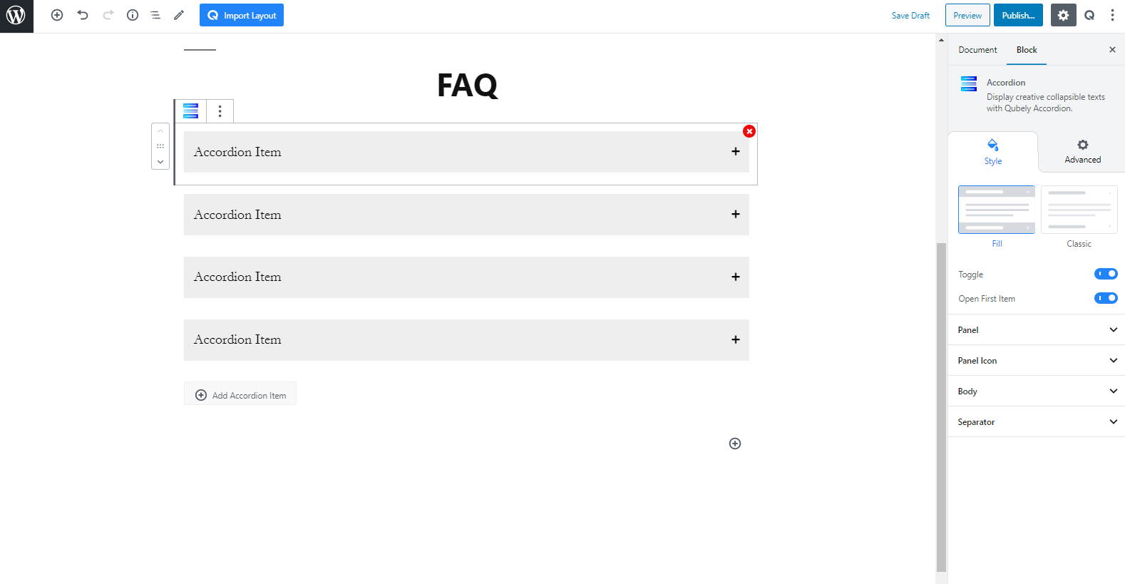
To add the block, simply go to the page or post where you want your FAQ section to be. Go to the edit mode and click on the plus (+) symbol in the top left. Search for “Accordion” and click on it to insert the block.
Step 3: Customize the Colors
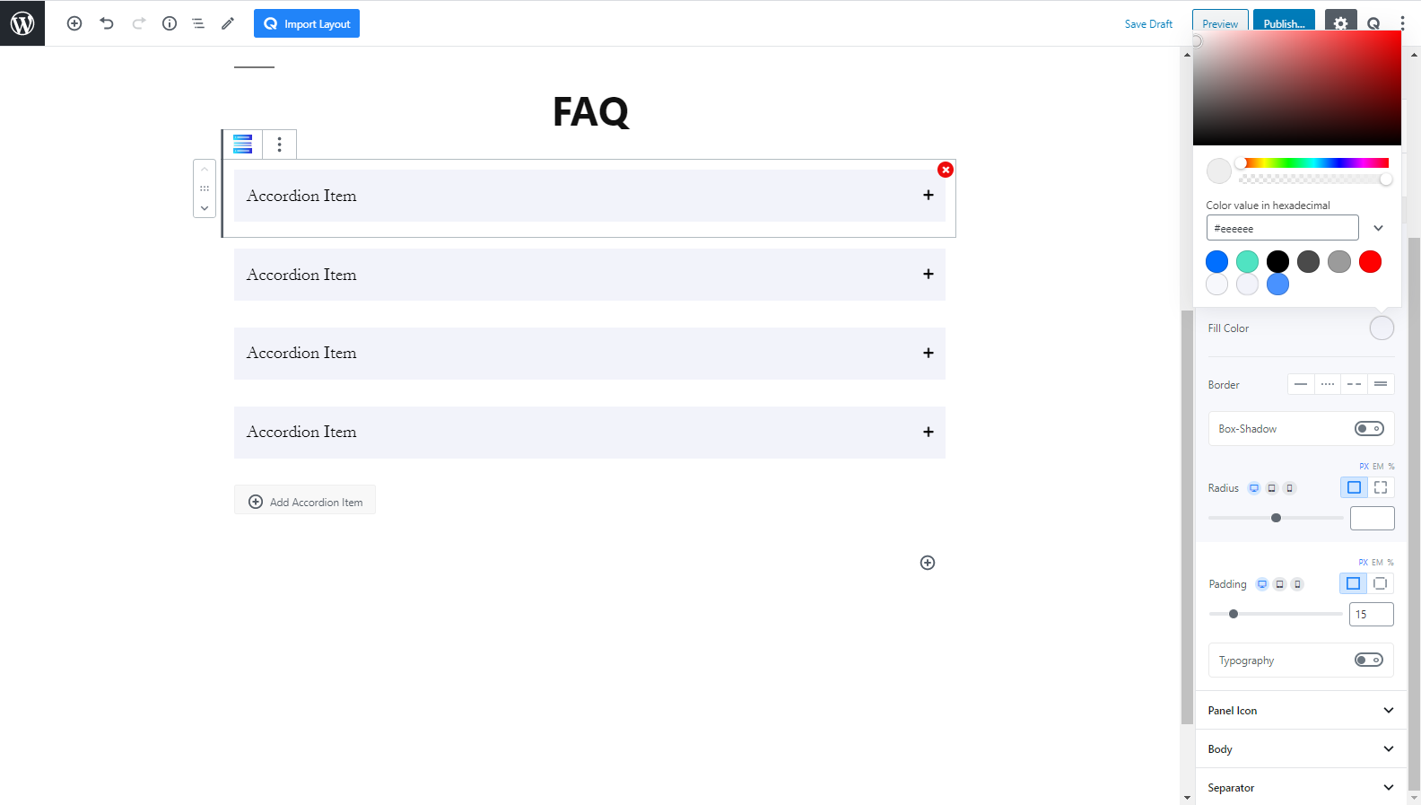
On the “Panel” section in the sidebar, you’ll find color controls for all aspects of the accordion block. In my case, I’ll use a light pastel color for the inactive panels, and a vibrant blue for the active ones.
Step 4: Customize Look and Feel
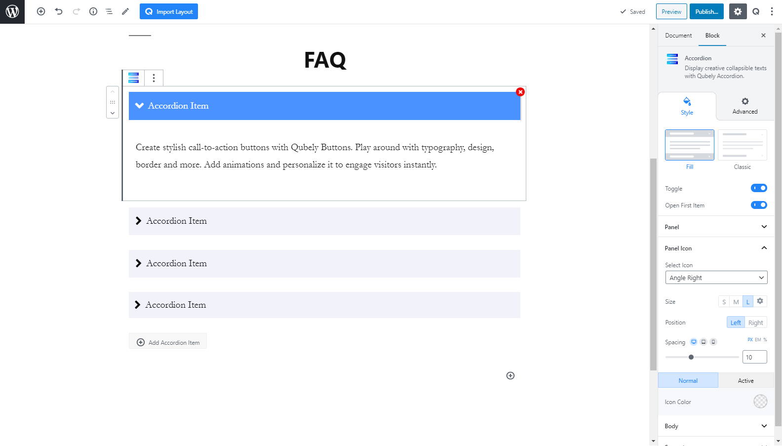
From the panel section, I will enable a box-shadow effect on the active panel. This will only apply a box-shadow on the active box. After that, I’ll customize the panel icon. I will make it bigger to improve readability and have it on the left of the block. I will also choose an arrow icon style. The colors can remain the same as it works perfectly for visibility.
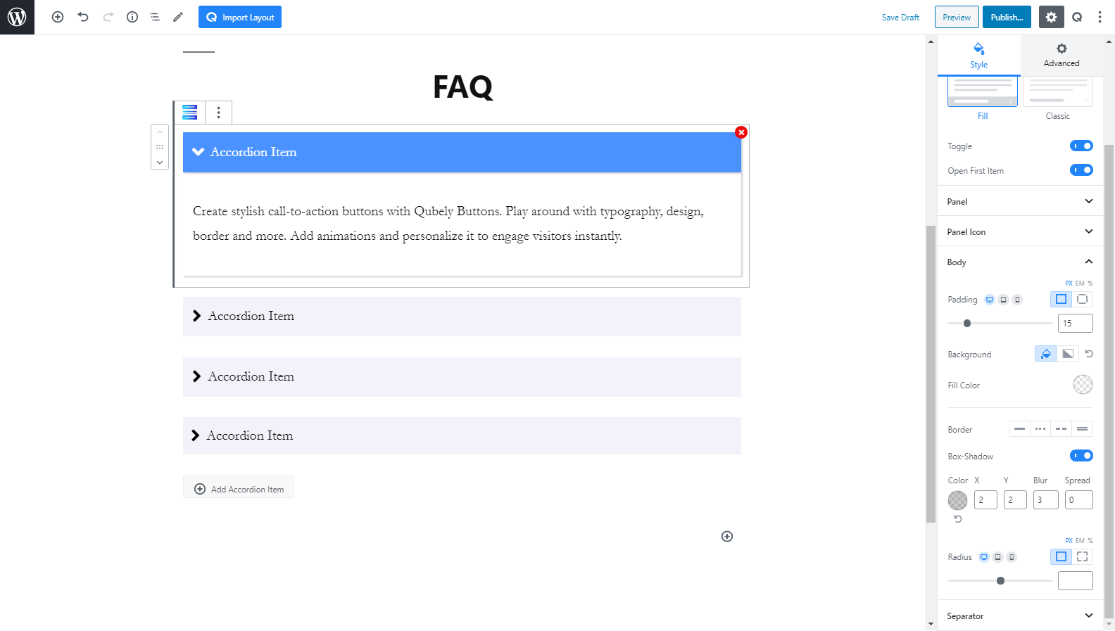
Then, onto the body tab of the sidebar, I will enable the box-shadow. You can also change the color of the body to match that of your theme, but here I will keep it as default.
Step 5: Add Content
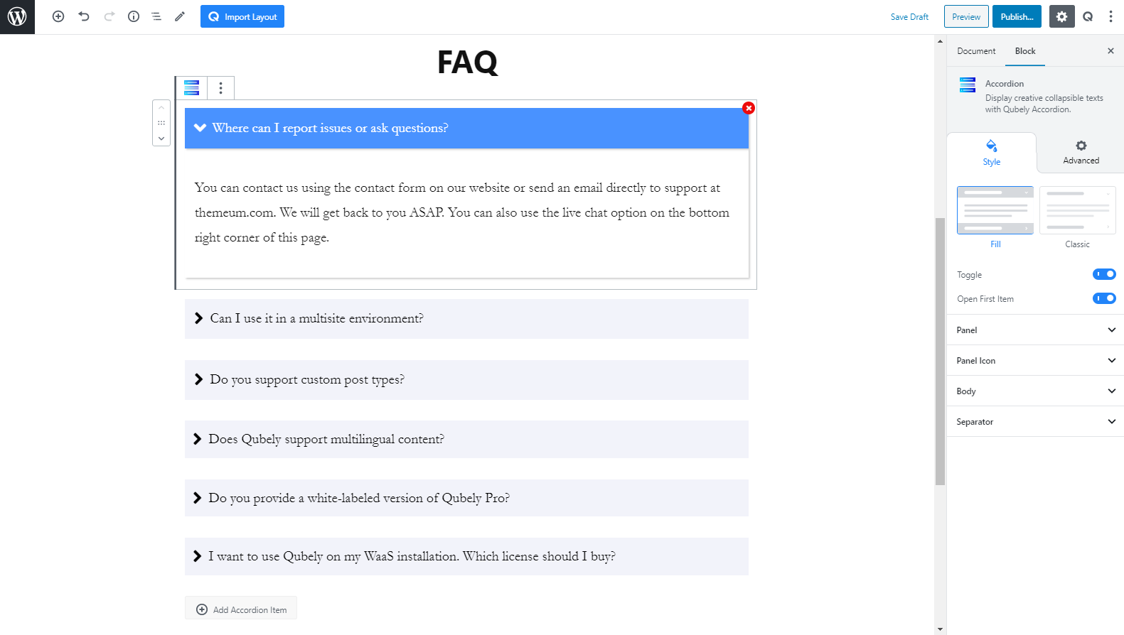
Finally, the most important part, I will copy and paste the FAQ content that I have written. To learn more about what kind of content should be placed here, please keep reading to find out!
What Kind of Content Should I Put?
More than the appearance, you must also pay attention to the actual content on the FAQ section. An effective FAQ section:
- Illustrates audiences’ queries and answers.
- Covers a wide range of questions and probable answers from the user end.
- Highlights the FAQ part in several pages of the website.
- Has several internal links with the redirect option.
- Keeps it up to date with regular up-gradation of information.
- Presents a neat and alluring showcase of design, style, with quality contents.
Best Places to Place and FAQ Section
To ensure the best practice of FAQ with Qubely, you need to display it in the pages where your audience tends to visit the most and get curious.
We’ve included a list of pages below where you can showcase FAQ for the best outcome.
- Homepage: This is the page that people go through at the first stage of any website. Placing FAQ on this page would be a smarter trick to let your audience know more deeply about your services.
- About Us: Generally, those who need more insights about your business visited this page. Linking FAQ with, ‘About Us’ will create a scope for you to present your business with complete information to your website visitors.
- Service Page: Your potential customers are more likely to check out this page before confirming their purchase decision. Including, ‘FAQ’ on service pages would help them to get useful information regarding their purchase.
- Contact Us: You can highlight some of the important, ‘FAQ’ parts here with the Contact Us page to ensure your users get a quick view of their required information.
Getting it Right
Whether you choose to showcase an old-school or modern style FAQ, what you need to focus on is its effectiveness. You need to outline every question and set of answers in a manner so your audience gets their needed information.
Here we’ve mentioned a list of things that you can follow to maximize the benefit of your FAQ page.
- Keep it Short and Precise: Instead of reading, most of the time people like to scan through the content at a glance, thus making it user-friendly for your audience, keep it short yet useful.
- Ensure a Quick Navigation Experience: Do not upset your visitors with poor experience with navigation. Keep it as fast yet responsive as possible to ensure maximum satisfaction.
- Highlight all Relevant Information: ‘FAQ’ can be a great tool to showcase your expertise, build trust, and authority over your brand. Make the best use of it by highlighting all relevant information that proves beneficial for your users.
- Use Redirect Link Where Applicable: Definitely no one expects traffic for FAQ pages only. Try inserting relevant redirect links in contents wherever possible for better engagements.
Wrapping Up
We’ve always tried to make the use of WordPress simple for our users. And, following this trend we’ve featured, “Accordion” in Qubely block section. Those who were looking for an up to date yet easy FAQ solution for their websites, we hope you’ll find this tutorial helpful.
Although you may find lots of plugins to create your FAQ part. We’ve tried to bring the most spotlighted solution for you. Now, try this out and do not forget to share your valuable feedback with us in the comment section.

